Exploring can be easy.
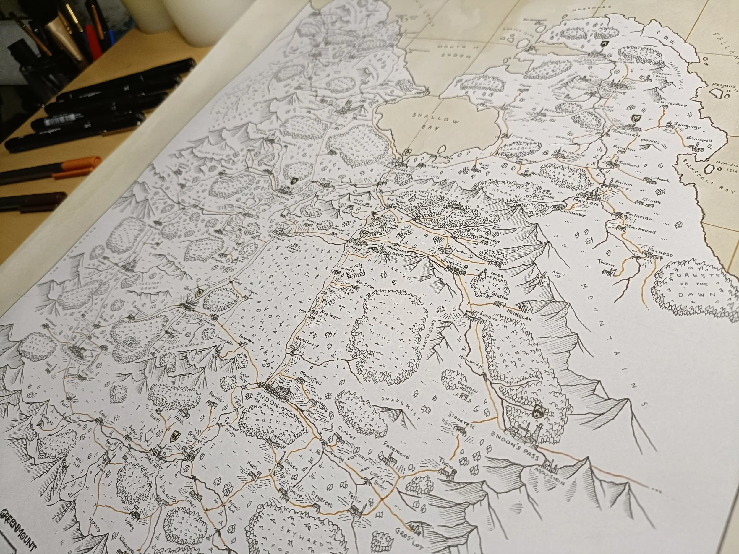
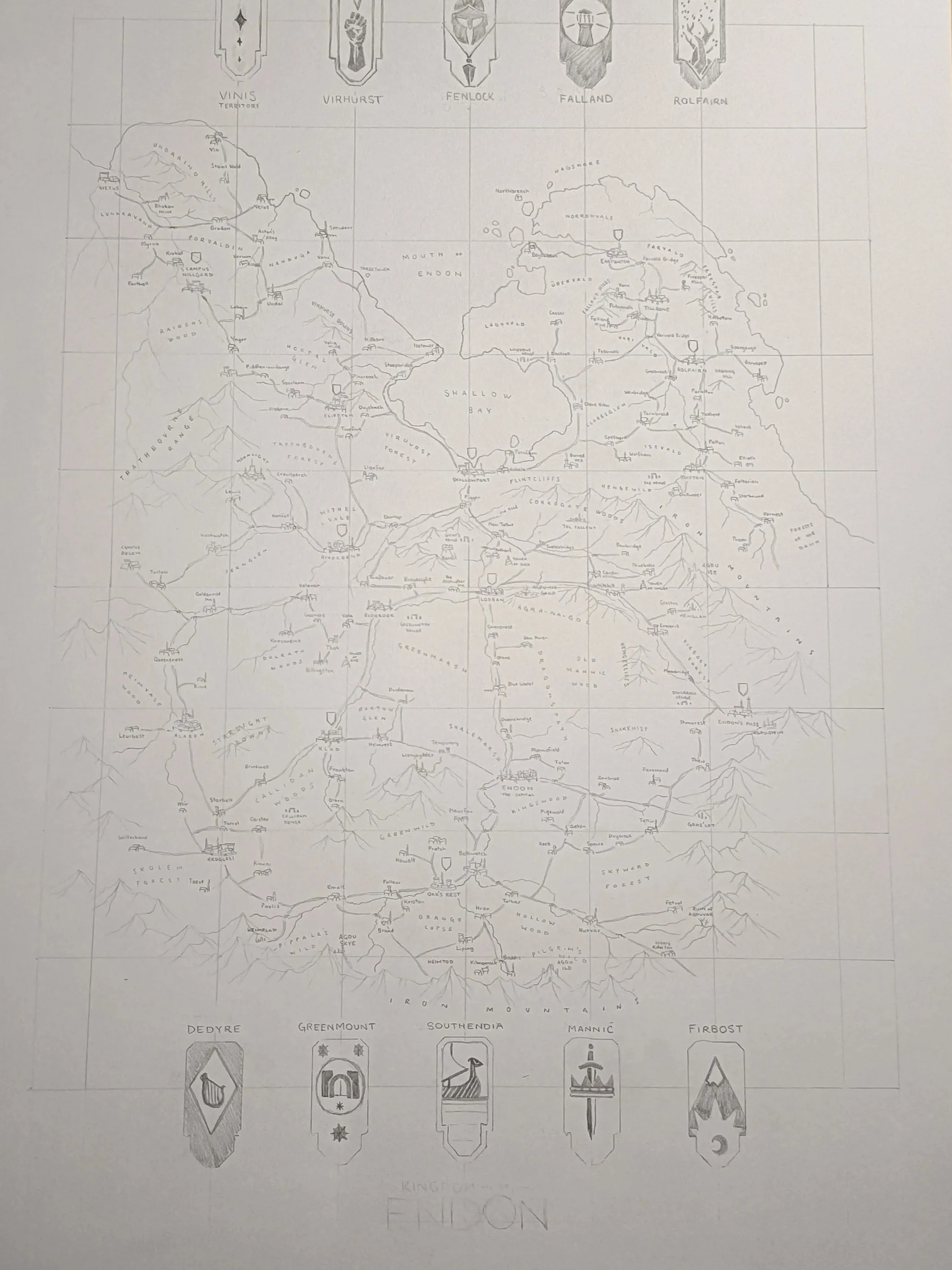
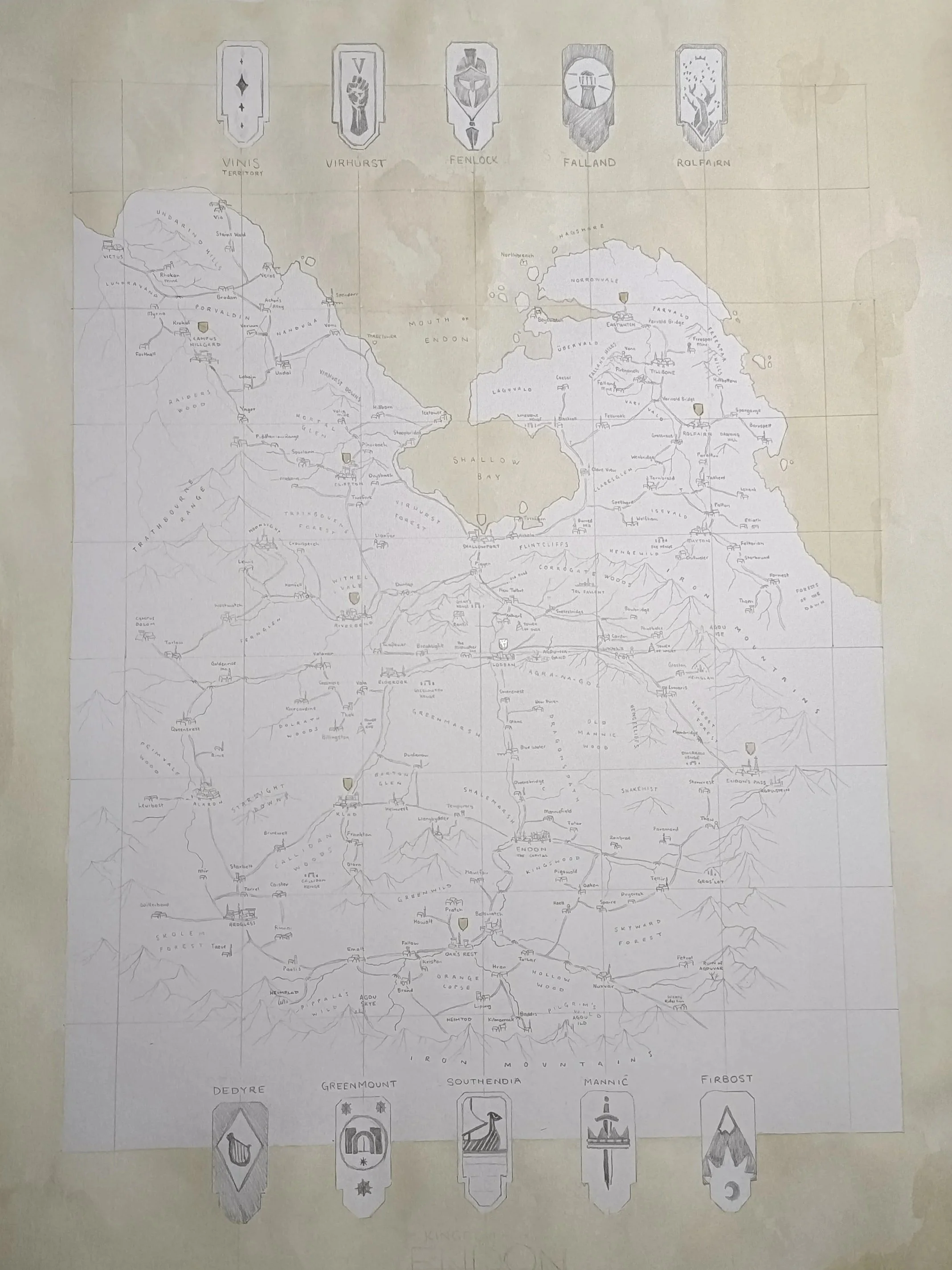
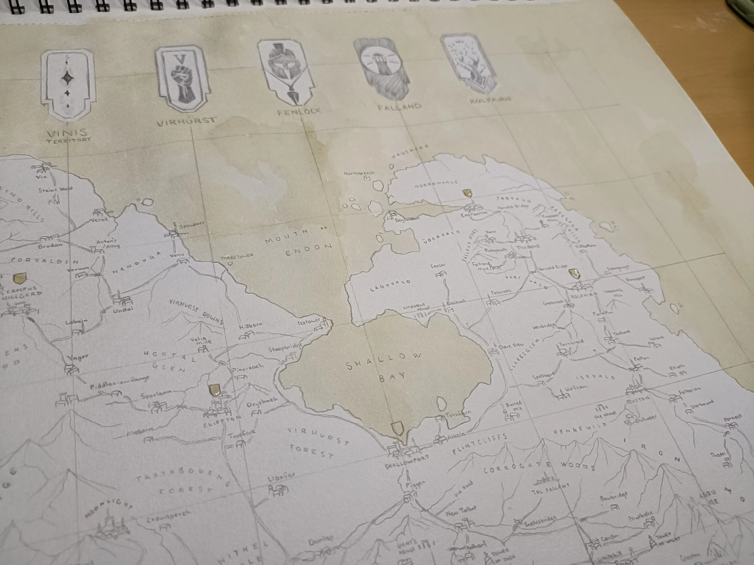
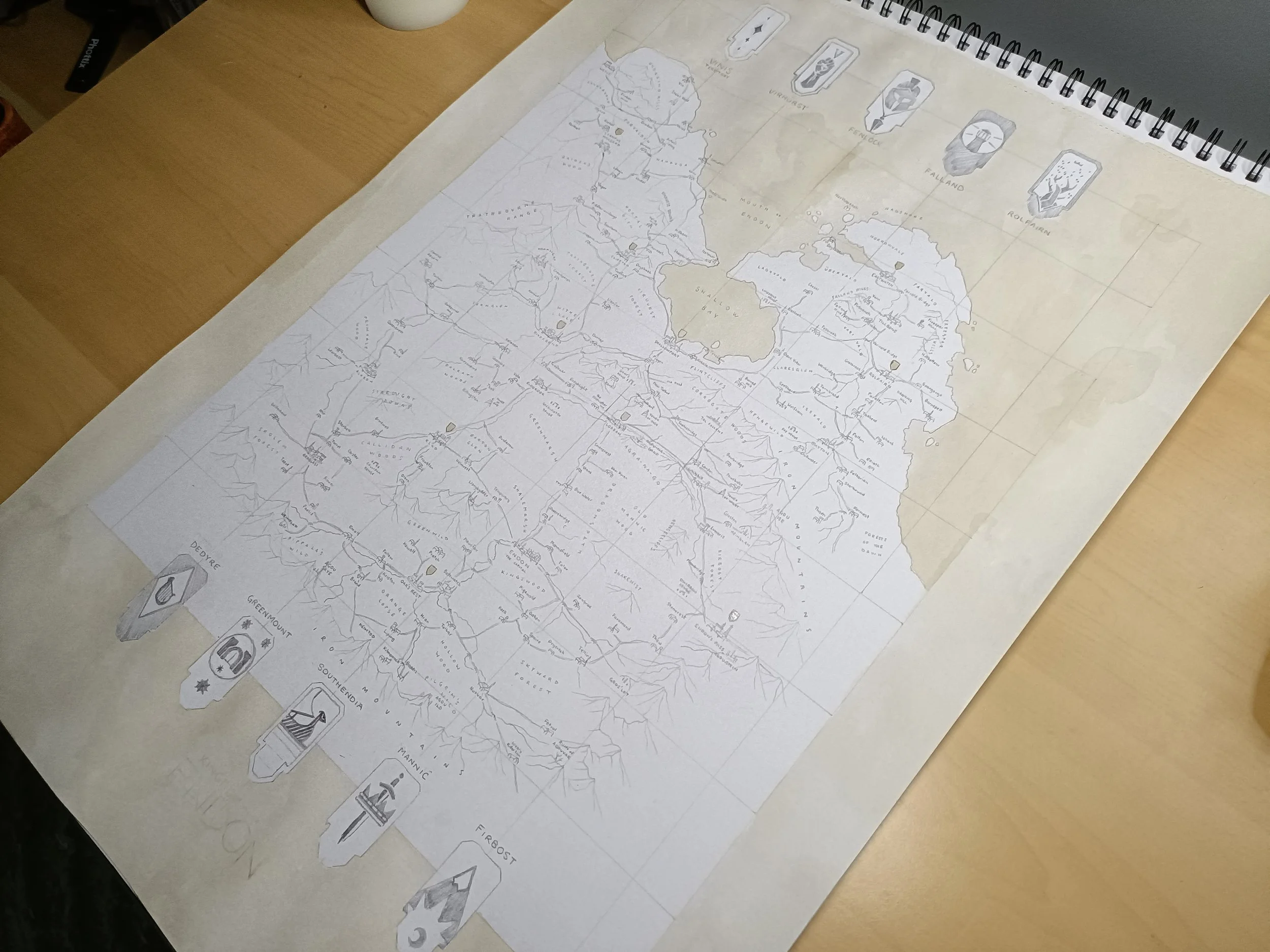
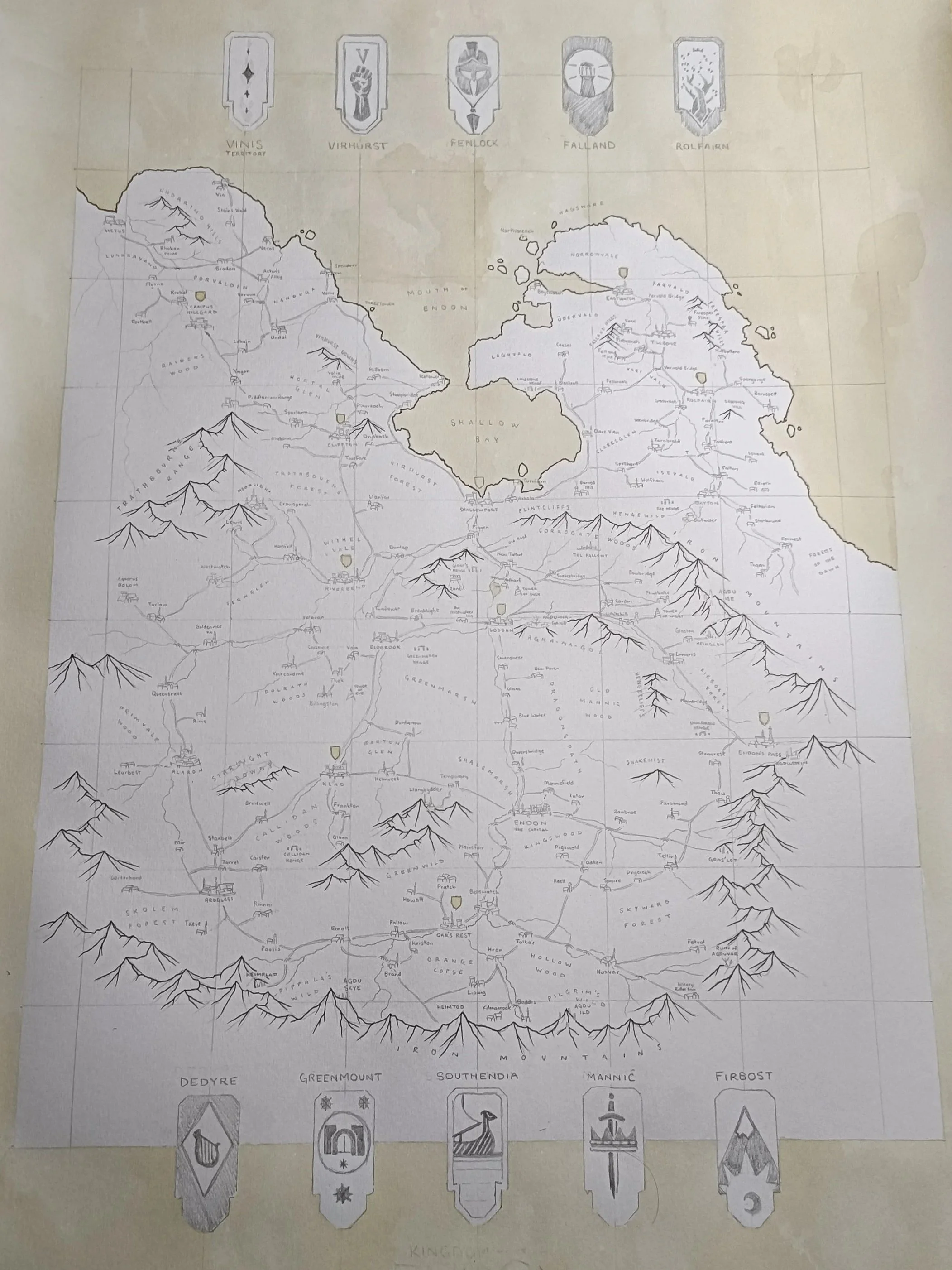
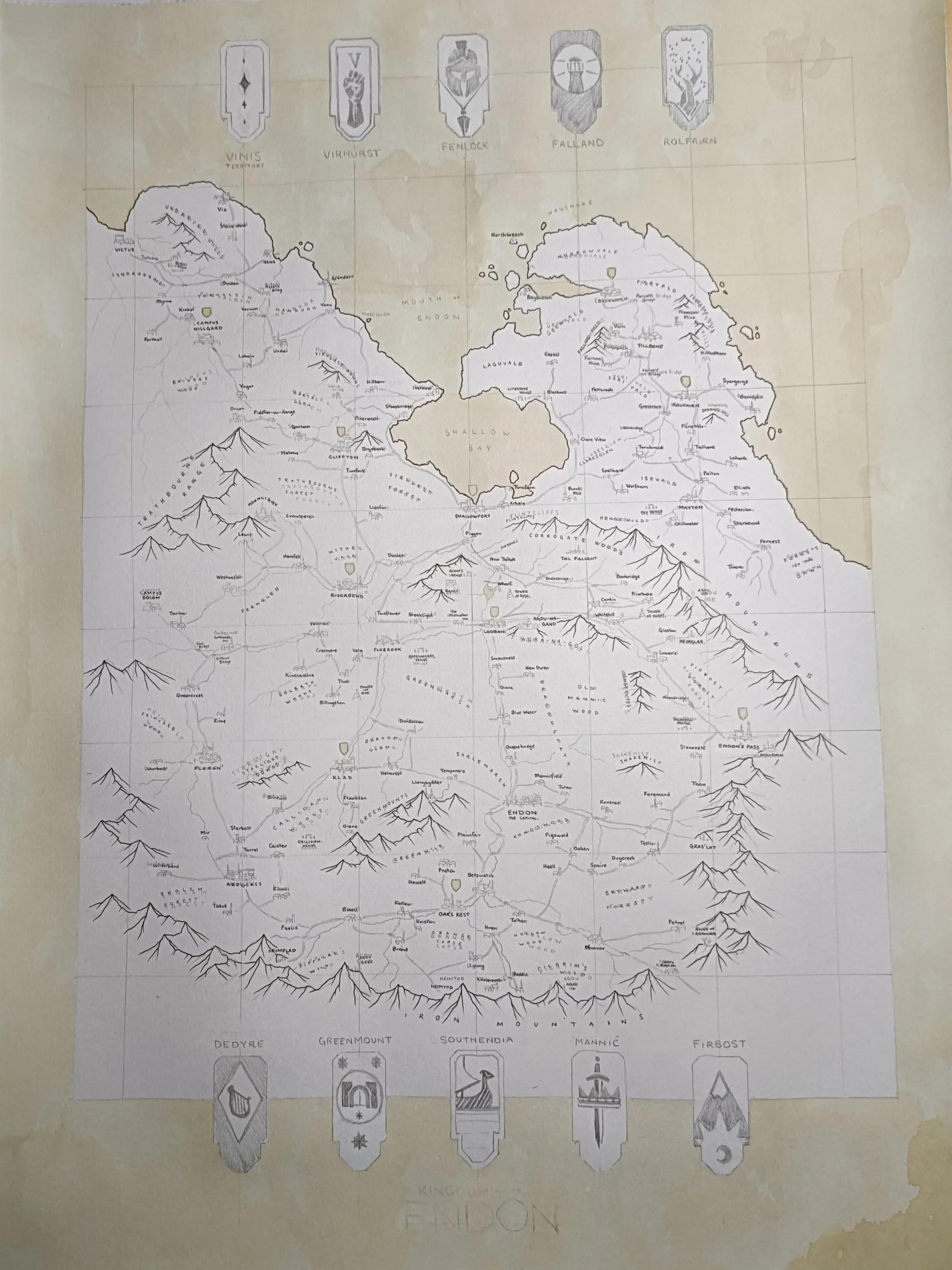
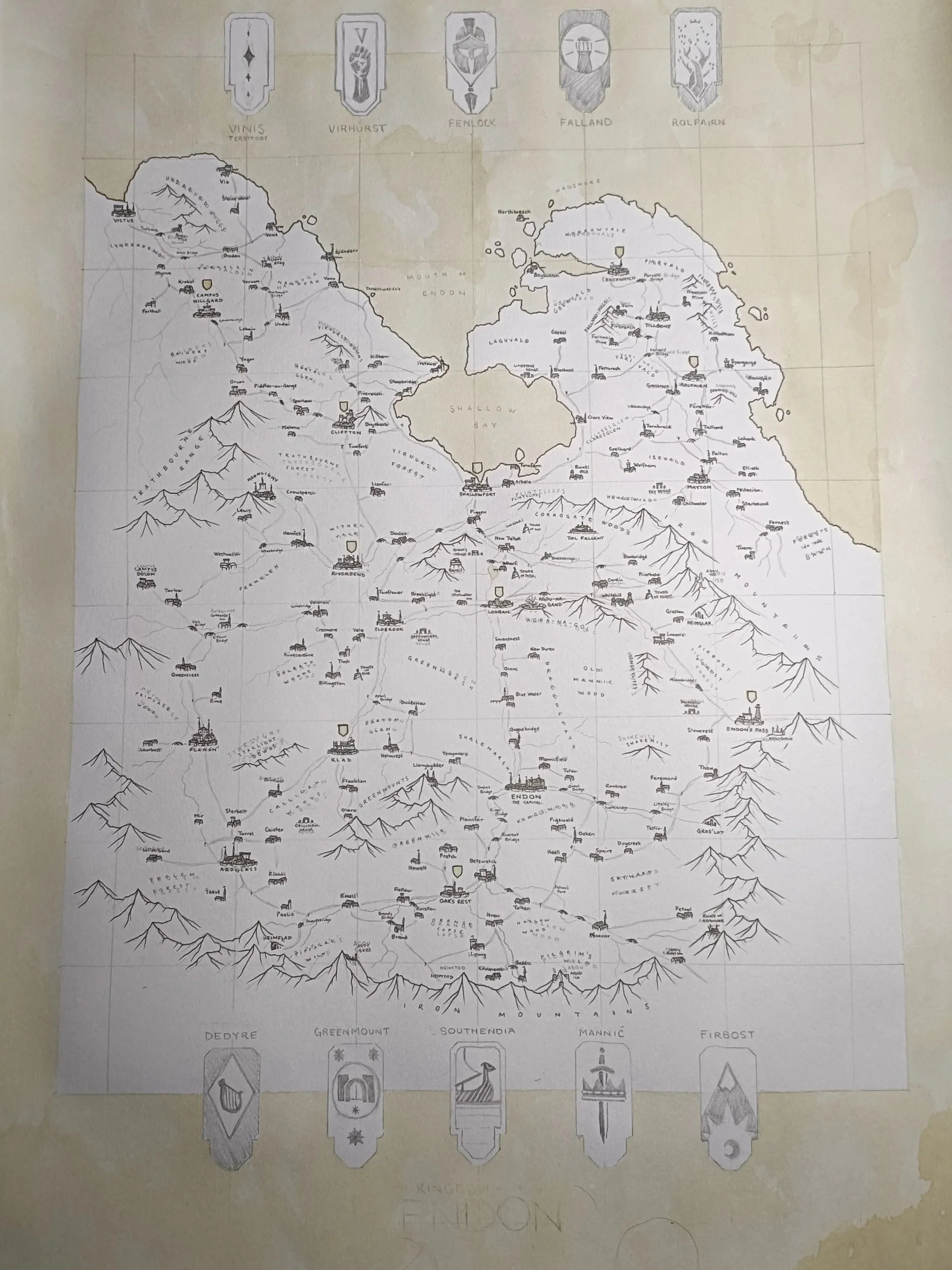
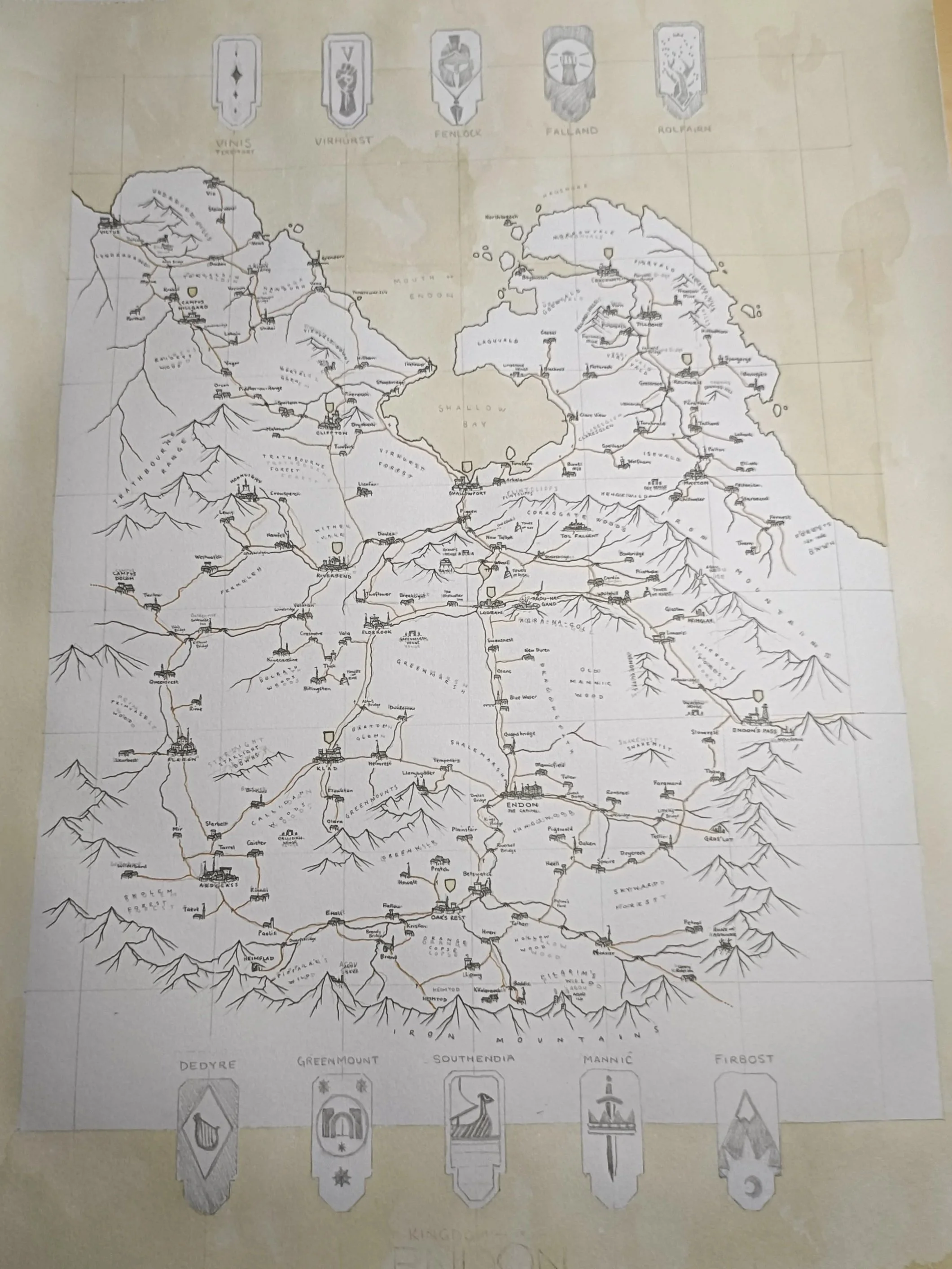
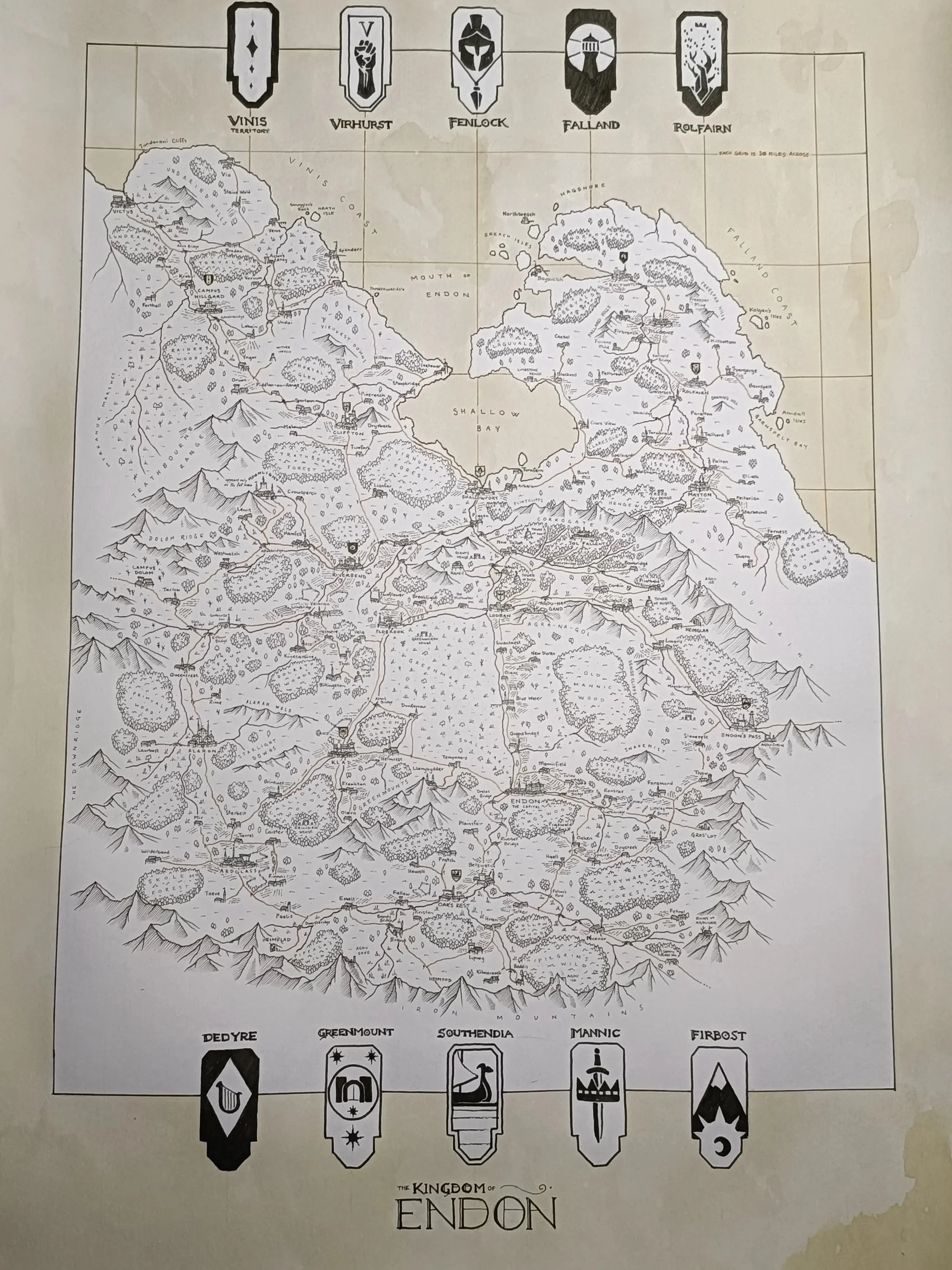
Take a look at this map that Ryan of the Red Quills recently created, based on medieval styles and fantasy contemporaries. Doesn’t it make you want to step out and see the world?
Step 1:
Sketching
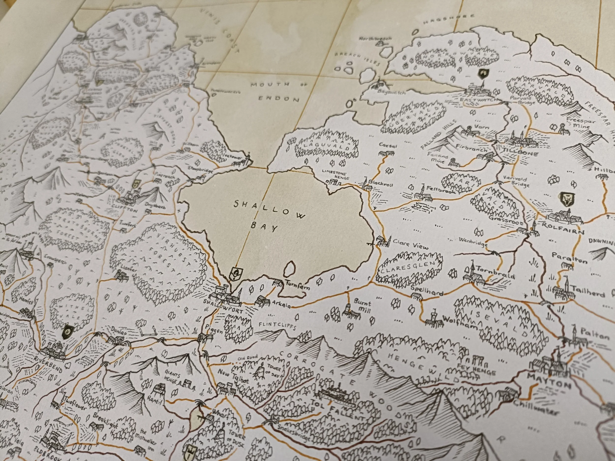
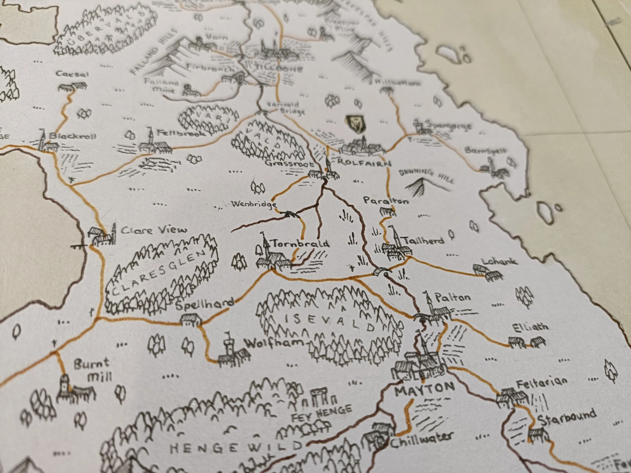
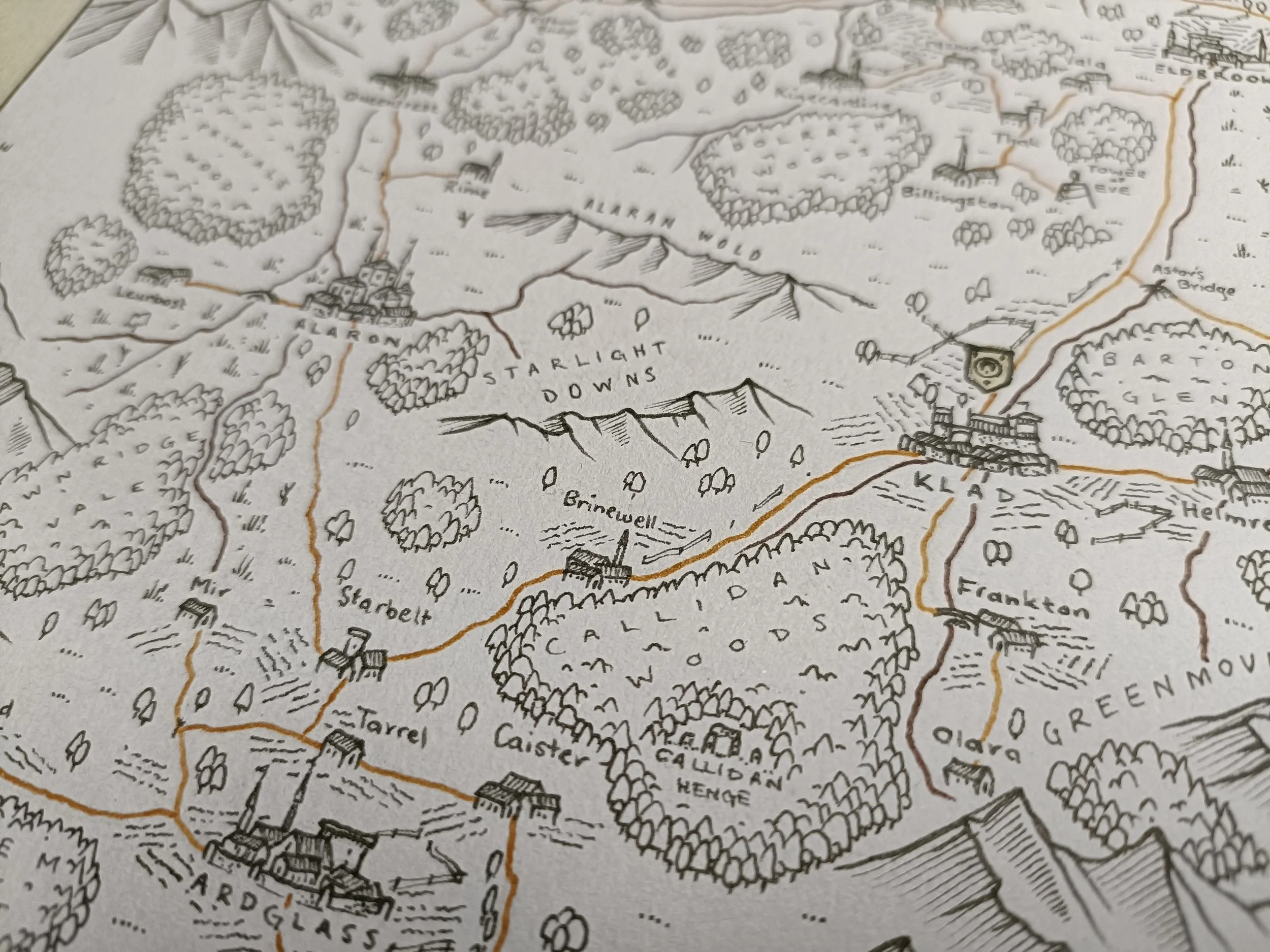
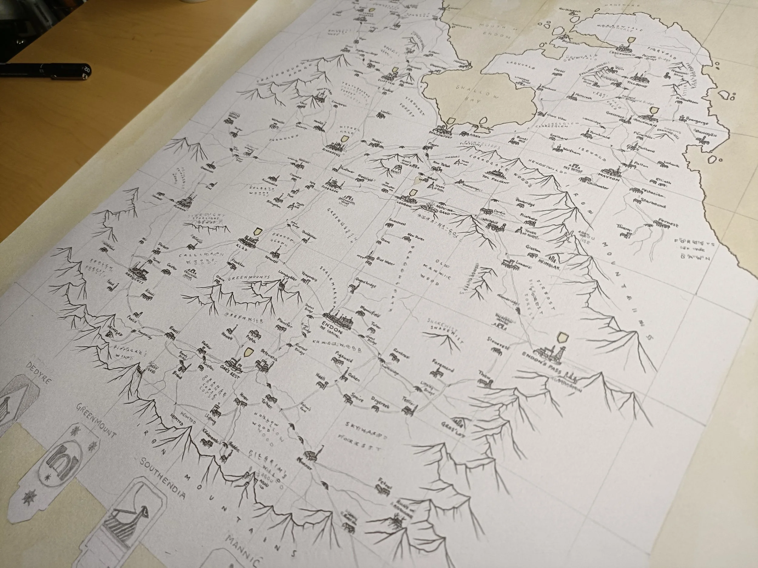
I've spent the last couple of days measuring out and sketching the map. I'm using previous maps that I've done of the area and creating a more consistent style. It took me quite a while to sketch out, as it's mostly just measurement. But I've made sure that I've placed the titles so that they can be easily read and added in the icons that I'm using.
Step 2:
Staining with Colour
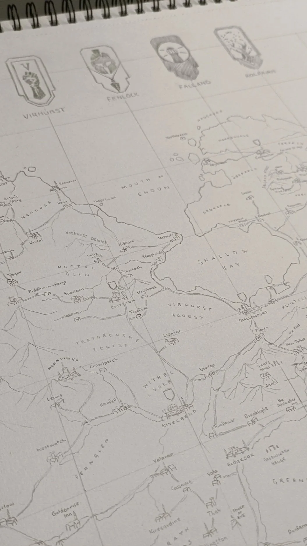
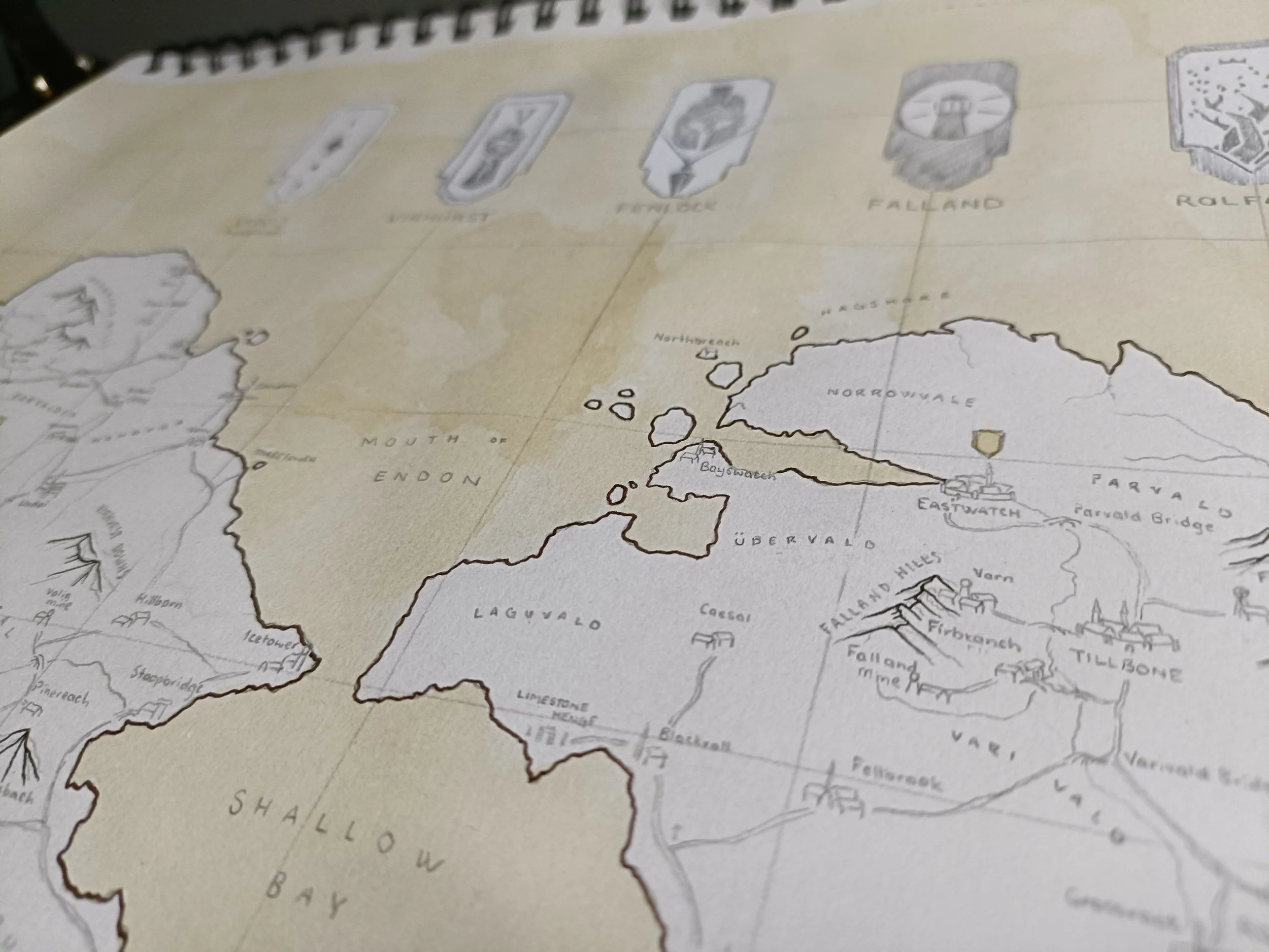
I have added the coffee stain. I went with coffee again, similar to my Andermonde maps, because the tea (which I used for my Moonlight maps, more to come on those) was a little too pale for my taste. I also like the way the coffee stain gathers darker at the edges. So I've gone through and brushed that over the sea and open waters, as well as the heraldry over the duchy capitals.
I'll wait for that to dry before heading into the next step.
Step 3:
Landscape
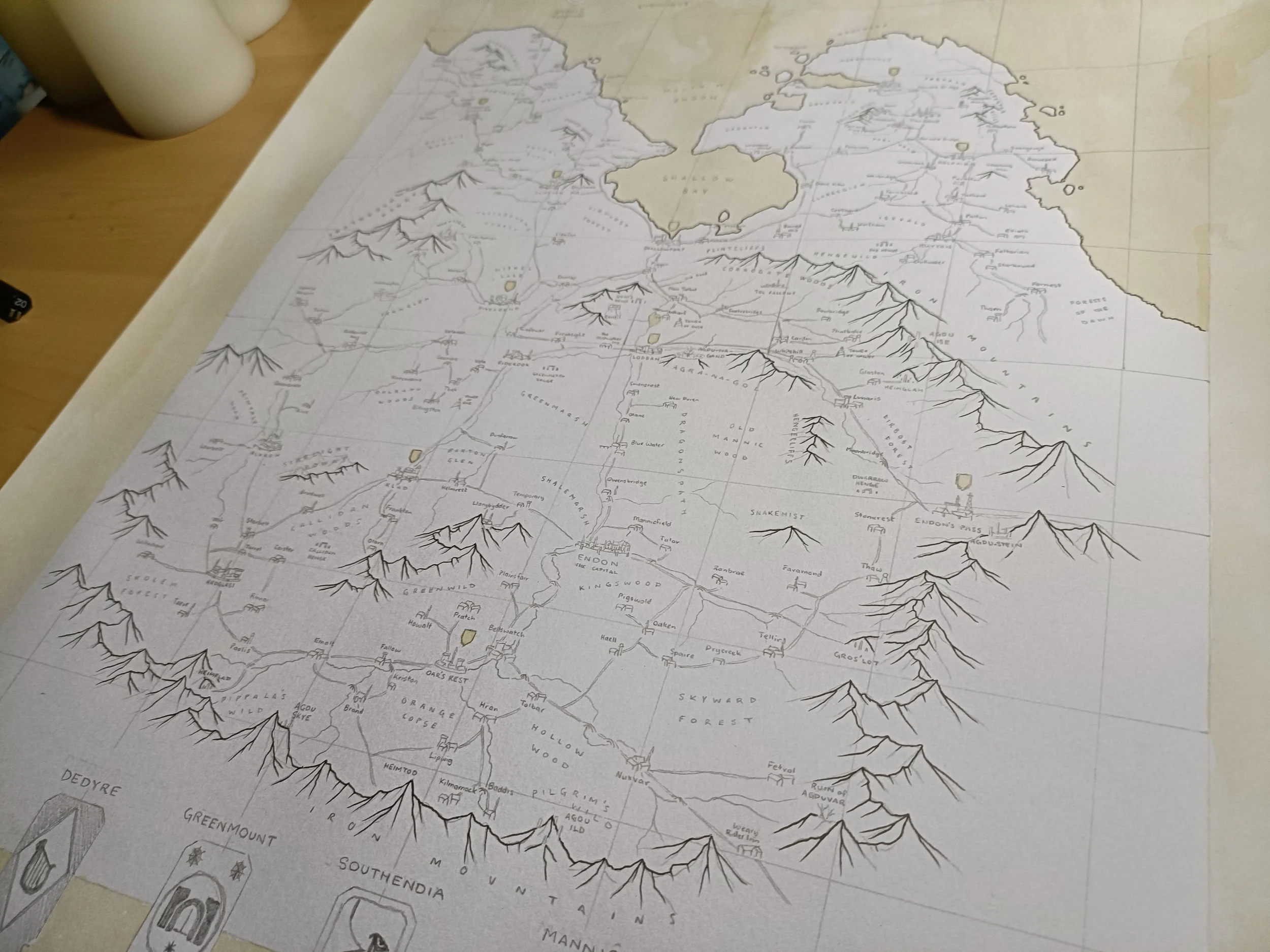
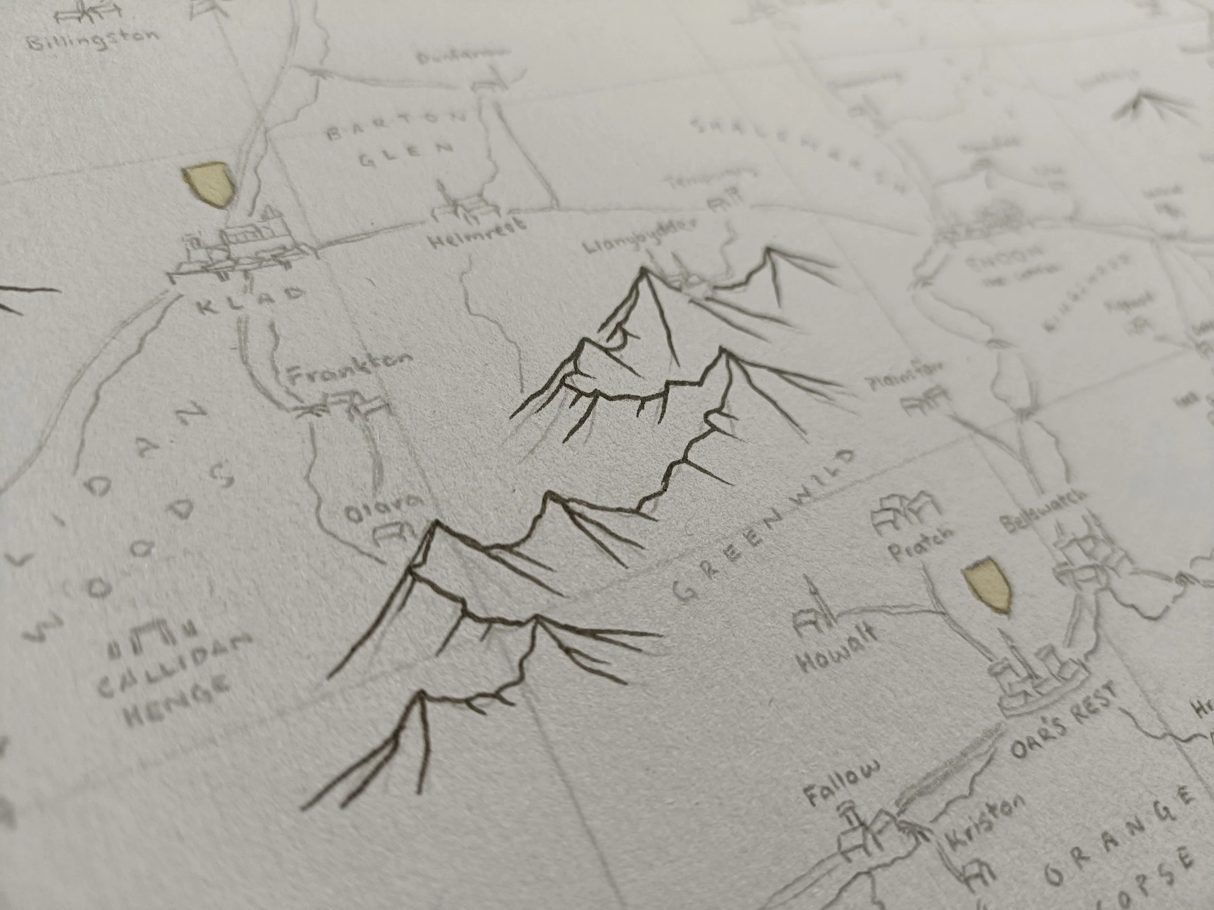
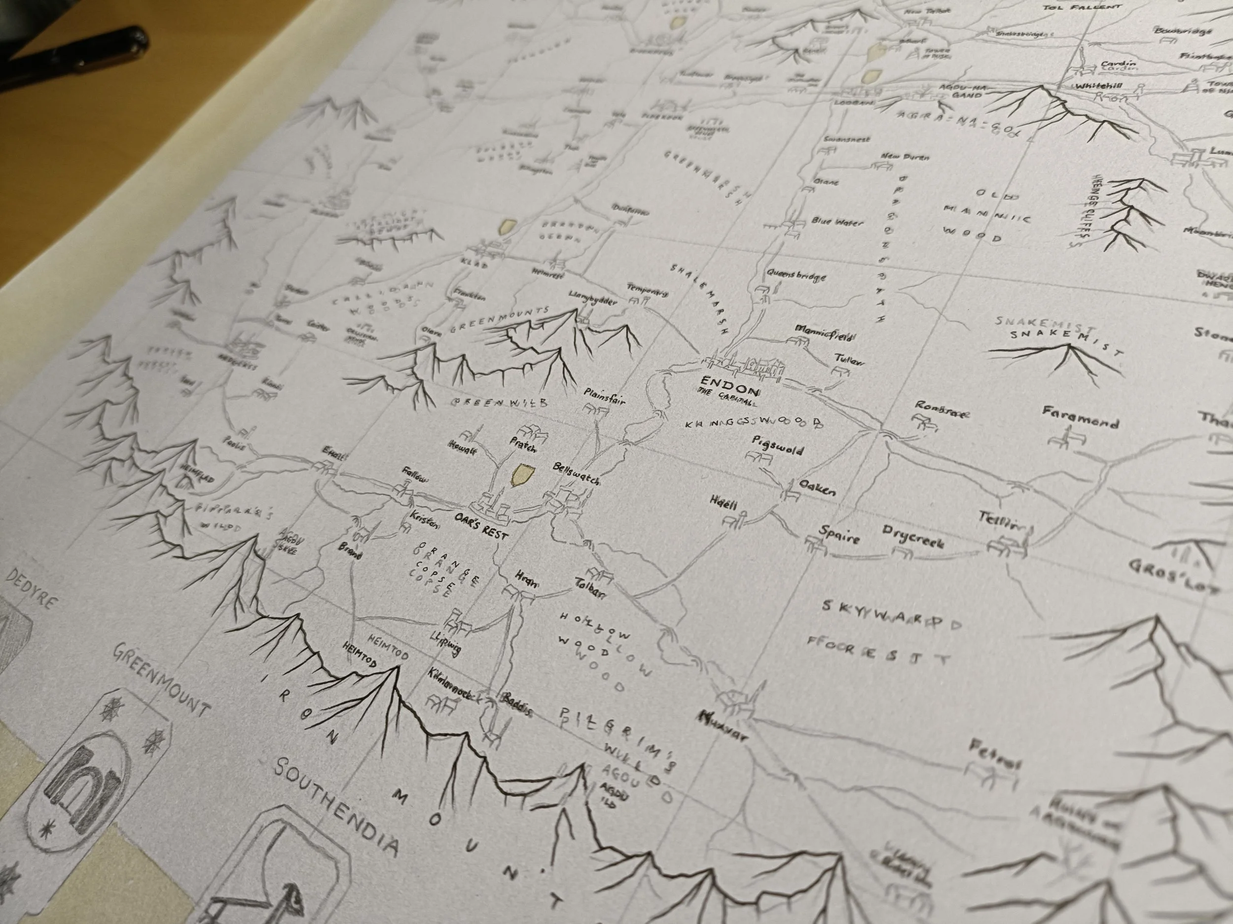
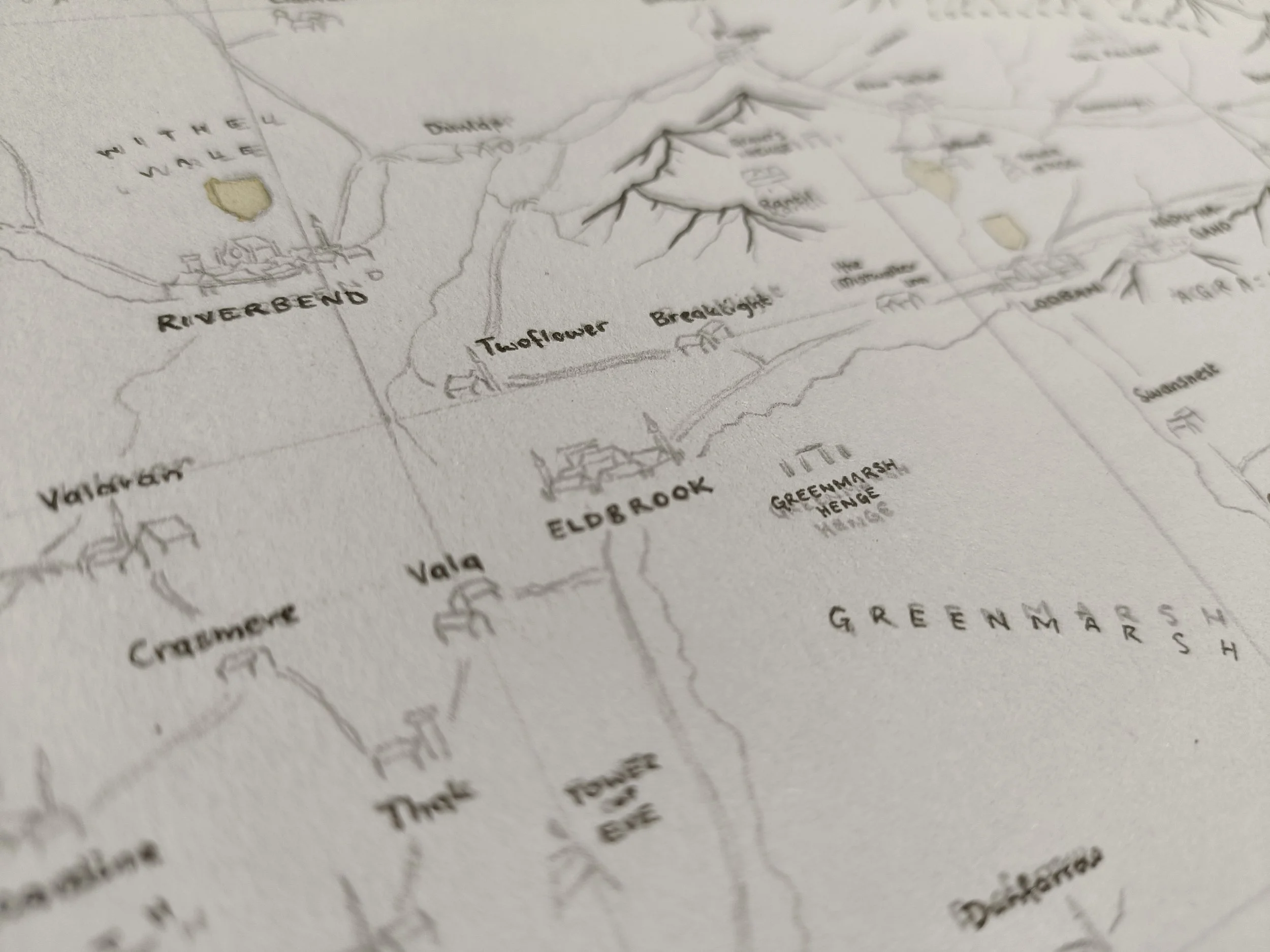
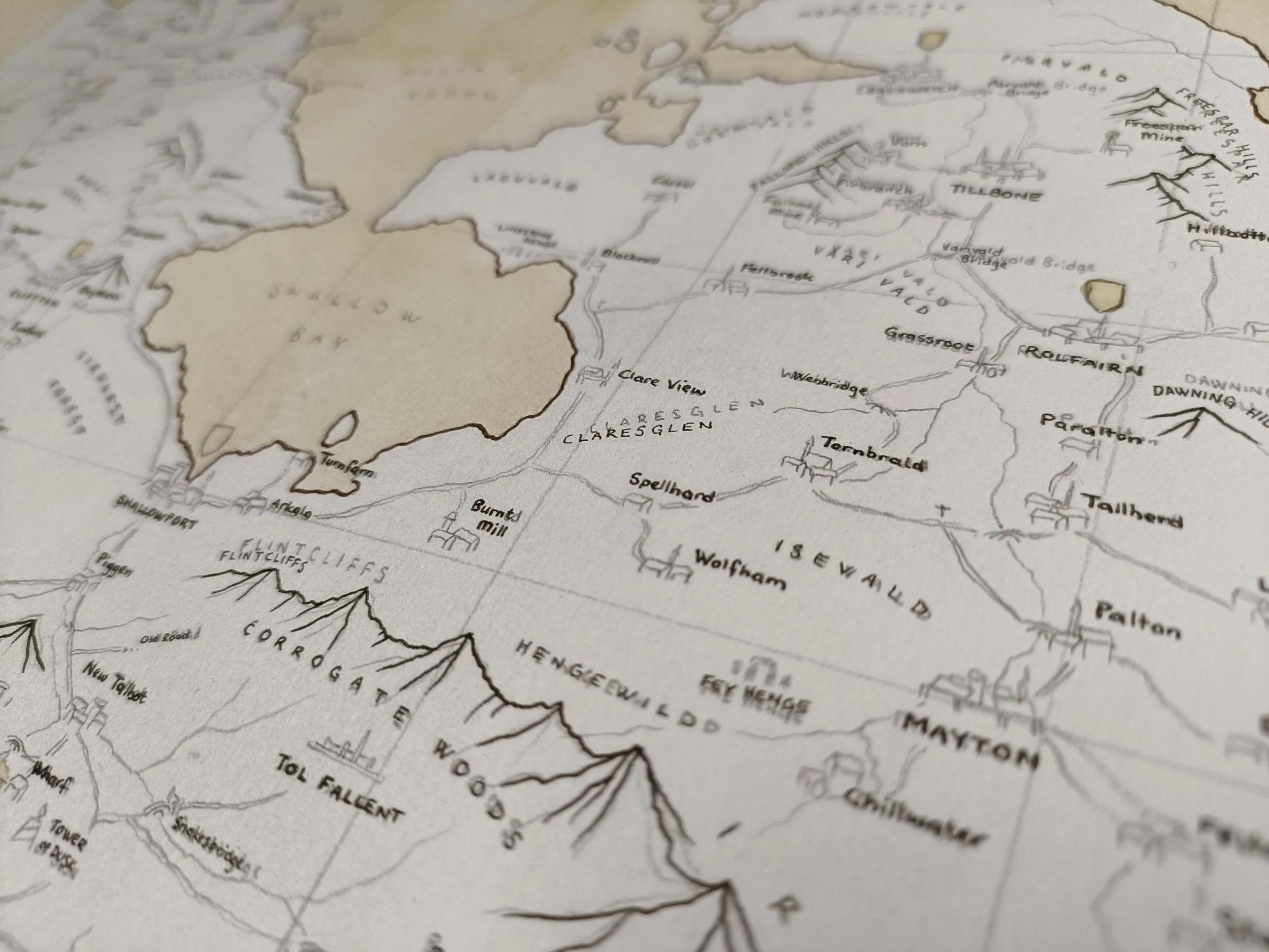
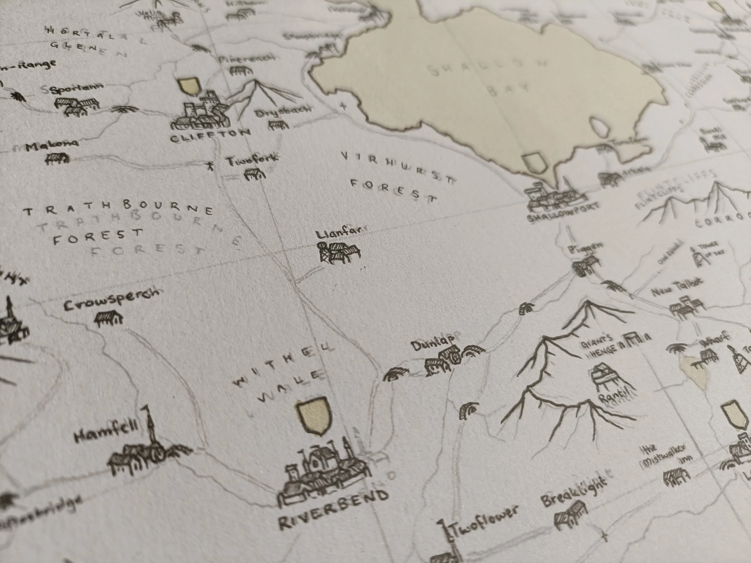
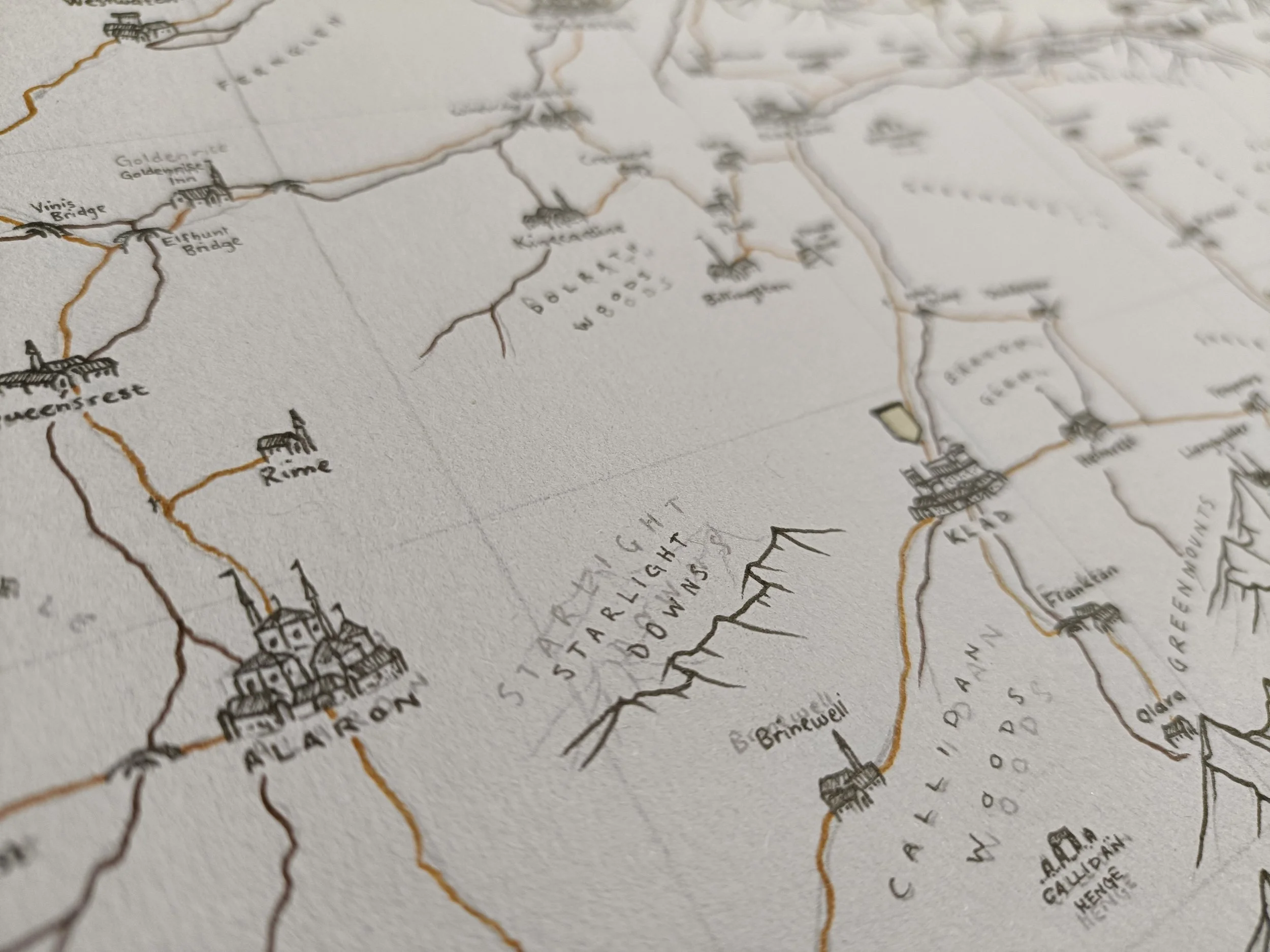
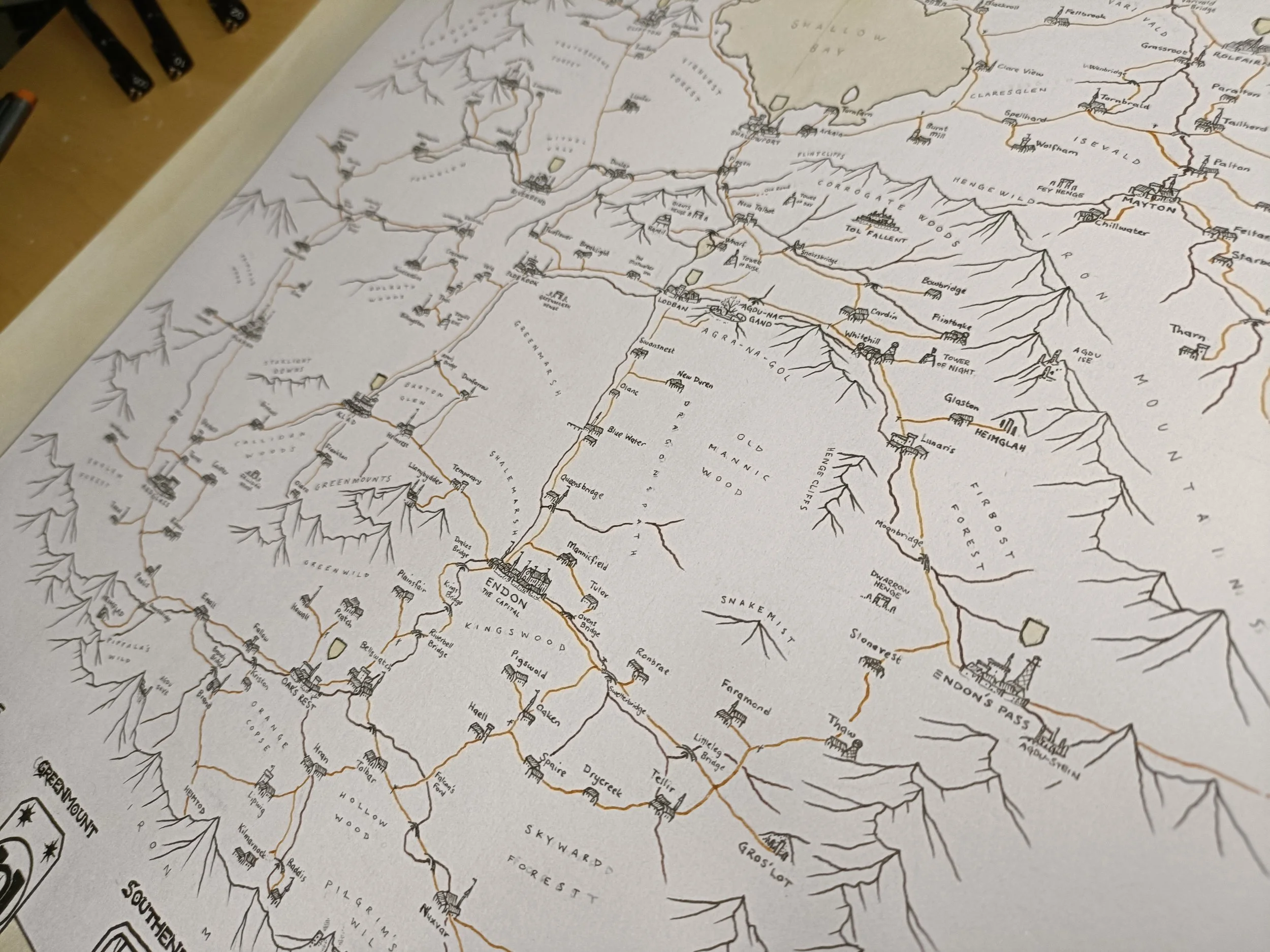
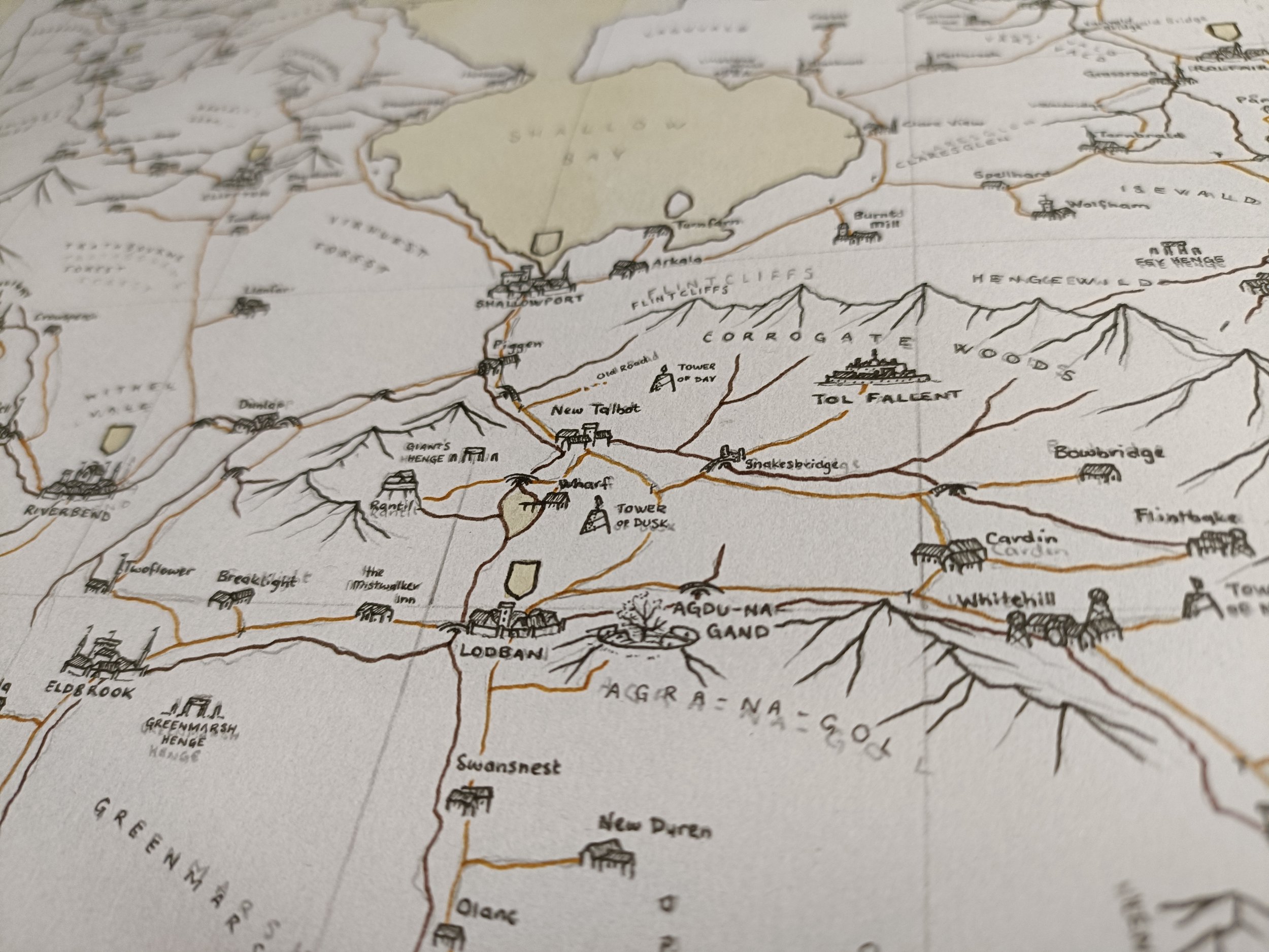
So I've gone through and done the coastlines now (in a dark brown fineliner) and the mountains. I want them to feel solid, so I'm prioritising them over other natural barriers like rivers or forests. I'll probably come back with my very fine pens later and do some wave patterns on the coast and shading on the mountains, but they're less important than establishing this hard line. Next is the labels!
Step 4:
Labelling
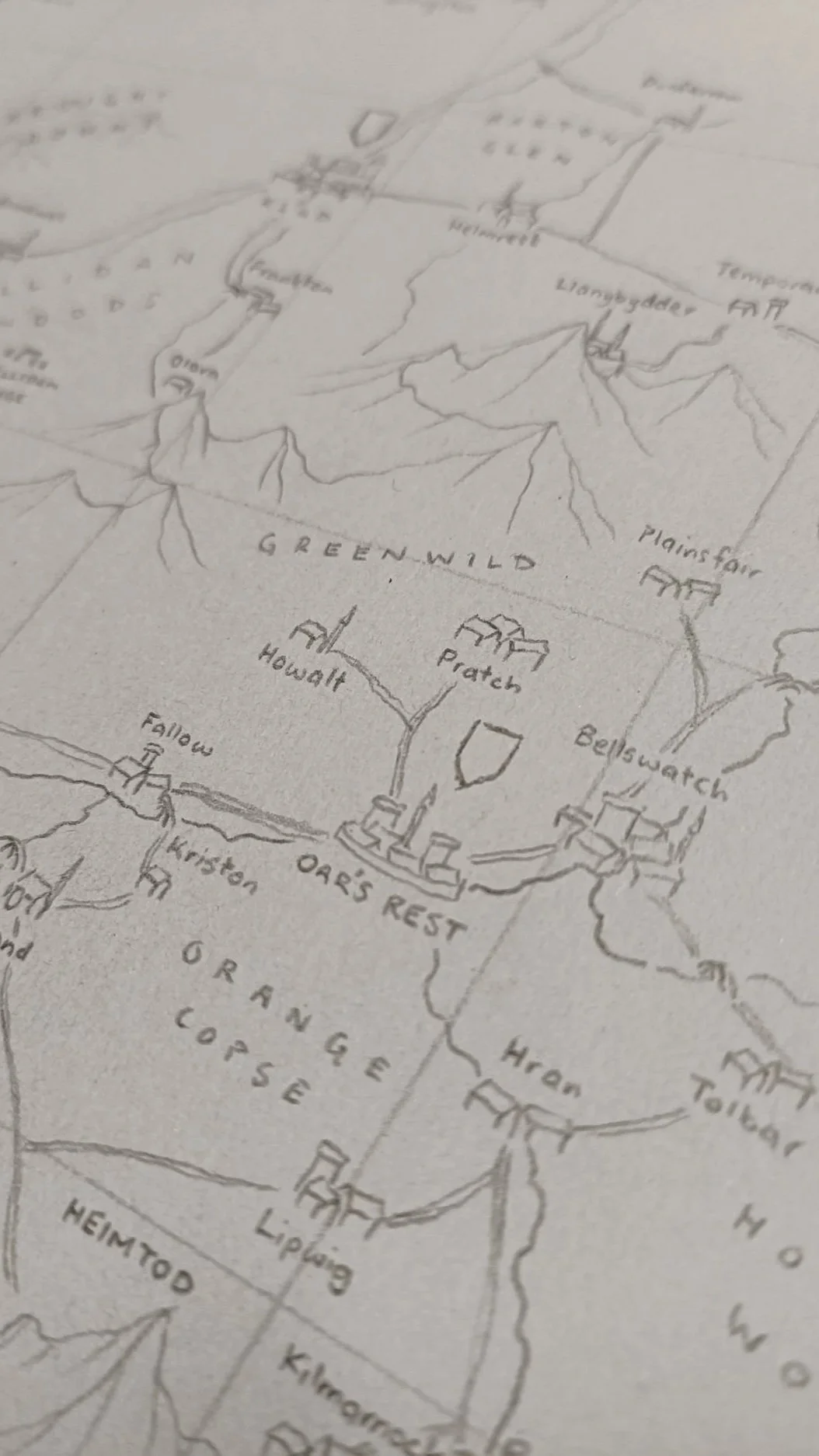
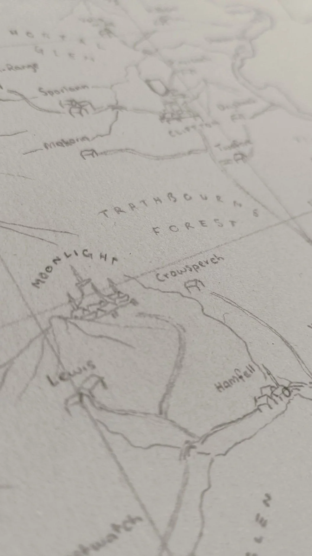
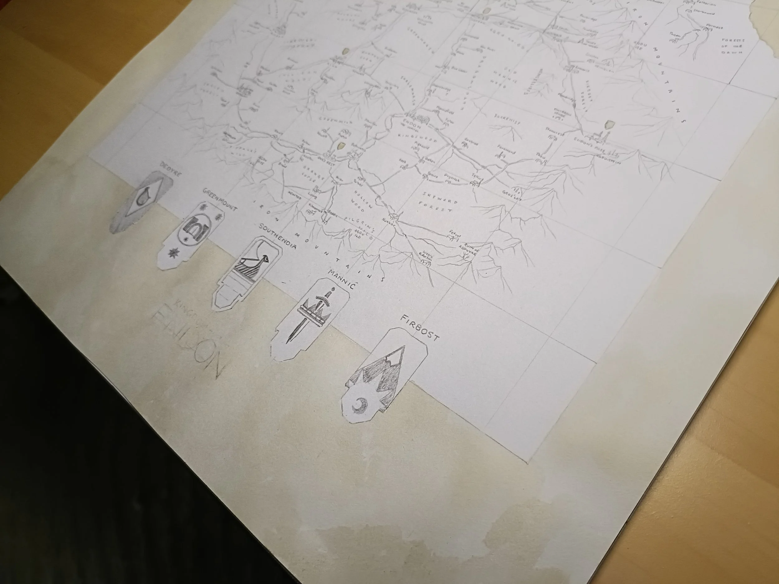
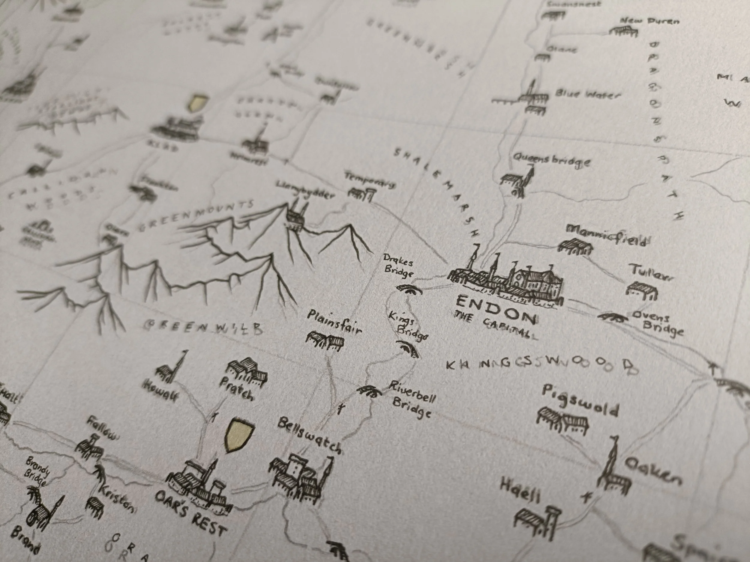
Alright, most of the labels are done now. I've only used black, which I'm not entirely certain was a good move (I don't want them to get lost in the rest of the map), but I will space them away from other icons and illustrations and make sure they're legible. I've used my thinnest pen (0.05mm) for the natural labels - mountains, hills, forests - and a slightly thicker one (0.1mm) for the settlements.
The reason I've used the black is because they are the thinnest pens I have, and this map is CHOCK full of details.
Step 5:
Town Icons
I've finished the town icons now. It's a hefty amount of work done, but still a fair way to go. I've used the same two pens (0.05 and 0.1) to do the town icons. The thicker for the outline, and the thinner for the shading and details. They're quite simple, but I've made them small enough that that doesn't matter.
Step 6:
Roads & Rivers
I’ve used a tan pen for the road network and the same dark brown as the coastline for the rivers. Between the two, that's as much colour as this map will really have. I've made the rivers dark brown for that congruity with the sea, a consistency for the viewer. But the road network is what I want the players to use to navigate the map.
They'll be using it to move around the kingdom and find points, and given that the icons haven't got colour, it's important that I give the eye something to focus on. Hence this choice.
After I finish this layer, I erase the pencil lines.
Step 6:
Heraldry & Landscape
The most time consuming step is to go through and add in each individual icon for trees, marshlands, plains, and so forth. While I go through and do that, I want to add in the details onto the heraldry as well. I’ll be using my thinnest pen for the landscape (0.05mm), and a variety for the heraldry.
The important part here is to acknowledge that it will take a long while, and not to rush. Stay controlled, calm, and give each part the attention that it deserves. It will be worth it in the long run.