

How I Make a Lovecraftian Map: Step-by-Step Guide to Crafting a Spooky, Secret-Packed Town Map
In my latest video I walked viewers through how I built a lovecraftian map for a Halloween special, and here I’m expanding that into a full written tutorial so you can follow every decision, every tool choice, and every design trick at your own pace. I made this map as the centerpiece for a mystery-focused tabletop campaign — a small port town perched at the edge of a hostile wilderness, full of secrets, candlelit promises, and the kind of quiet architecture that hides very loud problems.
Below I’ll take you through the exact process I used, step by step, including materials, composition, perspective, and how to layer in clues with a UV pen so your players discover secrets at the perfect time. Follow along and you’ll be able to create your own lovecraftian map that’s both visually striking and mechanically useful for your campaign.
Step 1: Gather the Materials (and accept the quirks)
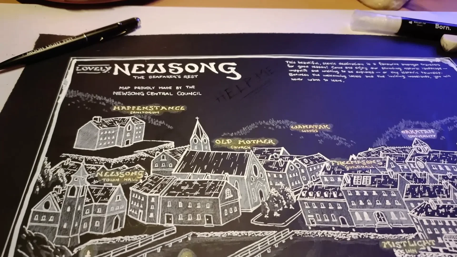
The foundation of this whole approach is that you’ll be working on black watercolor paper. I used an A3 sheet of black watercolor paper because the contrast of white on black is perfect for evoking lamps, lighthouses, and candlelit towns — all of which are staple imagery for any lovecraftian map.
This choice is striking but unforgiving. Gradients are harder to achieve on black paper than on white paper, so you must plan which marks will be pencil and which will be paint or ink. I use a small arsenal of whites and a couple of colored pencils for accents:
- Black A3 watercolor paper — the canvas. Thick enough to handle multiple media.
- Derwent Chinese White drawing pencil — for shading, textures, and soft highlights. Great for layered pencil work but won’t reach stark white on its own.
- Uni Posca white pen (0.7mm) — my thinner acrylic marker for fine line-work and labels.
- Bourne bullet-tip white marker (5mm) — the bold acrylic for titles, border, and big white planes.
- UV / moonlight pen — the invisible ink that shows up under a UV torch. This lets me add secret messages and eldritch imagery that only reveal under black light.
- Small UV torch — I use a curing mini UV used for miniatures; cheap and effective.
- Yellow and orange colored pencils — for warm “candlelight” glows behind labels.
- Fine eraser & pencil sharpener — again, precision counts with a black substrate.

Two practical warnings: the acrylic pens are not erasable and take time to dry, and working left-handed or right-handed matters when you place strokes. I work left-handed and therefore worked right-to-left; if you are right-handed, work left-to-right to avoid smudging still-wet ink.
Step 2: Plan the Town — Landmarks, Purpose, and Lovecraftian Staples
Before a single line goes down, I plan the function of the town and the locations players will consistently visit. A map for mystery and eldritch horror is not just decorative: it’s a tool for information-gathering. For a lovecraftian map, I aim to include both generic TTRPG necessities and Lovecraft-friendly spots.
Every RPG town needs these three practical categories:
- Somewhere to rest (an inn)
- Somewhere to gather supplies and research (a university, guild hall, libraries)
- Somewhere to get quests or leads (town hall, church, or an inquisitive NPC)
On top of those, for a lovecraftian map I add a list of evocative, theme-appropriate places:
- University / archives — where forbidden or forgotten knowledge hides
- Sanatorium — a place for characters who’ve glimpsed too much
- Lighthouse — a beacon of false safety and an obvious place for sea-bound horrors to be hinted at
- Church — moral contrast and a place to stir local superstition
- Woods / cliffs / shore — raw wilderness that represents the unknown
- Inn and tavern — gossip central
- Guild hall / freemasons — secret societies and human conspiracies

Give each landmark distinct narrative functions. The lighthouse can be a place where NPCs gather to watch the sea and whisper about strange lights. The university has the only real records of a particular ritual. The sanatorium contains witnesses who speak in half-truths. Those functions help you decide how to place and visually prioritize the buildings on your lovecraftian map.
Step 3: Block In a Pencil Sketch (Isometric + Perspective)
I’m a big fan of an isometric, inviting view that reads like a diorama. This choice makes a map feel intimate: the viewer is close enough to see details but far enough to understand the town’s layout. For this lovecraftian map, I borrowed some architectural references from the Newburyport-style villages that inspired Lovecraft — narrow streets, whitewashed walls, slate roofs, and brick work.
How I block it in:
- Start with the coastline and cliffs, because the sea edge defines how the rest sits.
- Place the lighthouse on a promontory so it visually dominates the harbor.
- Lay the main road from harbor to town center; cluster high-traffic buildings (inn, town hall) along it.
- Scatter lesser alleys, docks, and industrial spaces nearer the shore.
- Reserve the hills and trees behind town for wilderness that feels threatening — make those areas visually distinct later.
At the pencil-sketch stage I focus on the exterior silhouette of buildings first: the outside line, the roof shapes, the chimneys. Later I will add interior planes like walls, windows, and chimneys. Keep the pencil marks light and confident; you will be layering over them with white pencils and pens.
Step 4: Bring Depth with White Pencil — Walls vs Wilderness
On black paper the white pencil is your best friend for nuanced shading. I use the Derwent Chinese White pencil for two distinct purposes:
- To indicate the geometric, civilized structures — smooth planes for walls, flat shading for whitewashed facades.
- To render the wild areas — trees, cliffs, rocks — with a sharp, scratchy technique that reads as chaotic and dangerous.
The contrast is deliberate: buildings should feel like soft, safe geometry while nature should feel spiky and hostile. To make nature read as threatening, I sharpen the pencil to a fine point and do quick, angled strokes. For buildings I keep the strokes soft and broad.
Remember: pencil on black won’t get you stark white. You’ll create gradients and midtones, but if you need perfect, opaque white you’ll have to use pen or acrylic later. Use pencil to establish volume and texture; use pens to lock in the brightest highlights.

Step 5: Lock Lines and Titles with White Pens
When I move to the acrylic pens I switch mindset from “sketch” to “commit.” I used two different white acrylic markers for this map:
- Bourne 5mm bullet tip — for the main title and big white planes (thick, bold strokes)
- Uni Posca 0.7mm — for finer labels, windows, roof lines, and textures
Keep these rules in mind:
- Plan where the big white planes will be — landmark walls, the lighthouse, the university facade — and use the larger pen for those.
- Use the finer pen for the building interiors: window panes, shutters, roof ridges, and small signs.
- Because the pens are thicker than any fine liners I normally use on white paper, adjust the density of texture; broad cross-hatch and stipples will look heavy if overused.
For roofs I used a cross-hatch combined with spot stippling to evoke slate texture without drawing every tile. Take your time: these pens are opaque, and the marks cannot be erased. Work in passes, build confidence in each stroke, and let pen strokes dry fully before adding adjacent layers.

Step 6: Step Back, Re-Evaluate, and Iterate
One of the realities of working with unfamiliar media is that you’ll finish a step and suddenly realize some parts are too busy or too flat. I finished all the building pen work and came back and thought: “This is too cluttered.” That’s normal. My rule is simple: never change mid-step; finish that stage, then step back and rework the strategy for the next stage.
In my case I added more layers of white pencil to the landmark buildings (the university, the lighthouse, the guild hall) so they popped relative to the dense smaller buildings. This created visual hierarchy and helped the eye prioritize places your players are likely to visit. When working on your lovecraftian map you should also:
- Finish a step completely before making corrective changes.
- Squint frequently to see the overall contrast and balance.
- Test the map under different lights — white light and low light — to see how it reads at the table.
Step 7: Add Candlelight — Warm Glows for Safety
Once the big white shapes were set, I wanted the labels to feel like tiny candles — human-scale beacons of safety in a hostile world. I used white pencil to create a small halo, then added tiny circular strokes of yellow and orange pencils to create a subtle warm glow behind labels and over doors.
This little touch does three things:
- It visually separates labels from the surrounding white pen work.
- It creates narrative contrast — light (safety) vs dark (unknown), a core tension in any lovecraftian map.
- It makes the map more inviting to look at, and gives players visual signals where to start.

Step 8: Hide the Secrets — UV Ink and the Three Layers of Information
Here’s where the lovecraftian map becomes a living campaign tool rather than just decoration: I used a UV moonlight pen to add invisible notes and eldritch imagery. These marks are dormant until you shine a UV torch on them, creating dramatic reveals at the table.
When adding secret marks, think in terms of three layers of information:
Layer A — Public, obvious information
This is the white base map: streets, labeled public buildings, docks. Anyone can see it. That’s the “town as everyone knows it” level.
Layer B — Players-only, decoded information
The UV ink is usually given to players as part of the start of the campaign: they find the map and, if they have the UV light (or are told about it), they discover clues other residents don’t see. This layer should advance the campaign but not solve it outright.
Layer C — Double-locked secrets
These are notes that are still obscure even after being revealed. They might say “I left it here,” or reference an NPC’s nickname, or point to an archaeological marker the players must uncover through other means. Double-locks require players to be in-world and to do quests, speak to NPCs, or find an item to make sense of the clue.
Practical tips when using UV ink:
- Test the UV pen on your black paper; it slightly changes surface sheen and can show under bright light as a texture difference.
- Decide whether players find the map already aware it contains secrets. I usually give the map to players with a hint that “the ink you need is to hand,” so they know to look for a code or tool.
- Use scratchy, unreal drawing styles for eldritch images — avoid realism; make the shapes feel unnatural.

Examples of things I hid in UV on this lovecraftian map:
- Sketches of a few monstrous silhouettes placed where the party might later encounter cult activity.
- Notes like “Necronomicon in the archives” (a public-level hint) and “I left it here” (a double-locked indication that needs context).
- Small glyphs or cult sigils that can be traced to NPCs or hidden rooms.
Step 9: Add Written Clues, Flavor Text, and Mottos
After the UV ink and pencil work, I go back to the white pens and add narrative text. This is when the map stops being purely geographic and becomes a story artifact. Put in short sentences and tantalizing snippets rather than long paragraphs — they’re easier for players to read and act upon.
Types of annotations I add on a lovecraftian map:
- Direct statements: “Necronomicon in archives.”
- Vague clues: “I left it here.”
- Local mottos and rumors: “Visit once, stay forever.”
- Directional hints: “Pier: unsafe at night.”
When adding these annotations, be deliberate about legibility. Use the larger Bourne pen for the map title and strong mottos; use the Posca 0.7mm for notes that players should read at the table.
Step 10: Build a Border and Embrace Imperfection
I like a border to frame the map, but acrylic pens can sometimes leak. During the border step I had a pen leak and got blobs in the border. Rather than panic, I leaned into it: I turned those smudges into intentional oddities, repeating the irregular marks so the effect became an unsettling feature rather than a mistake.
Design lessons here:
- Not all “mistakes” are bad; they can add character consistent with a horror theme.
- If a pen leaks, consider repeating the motif to make it look deliberate.
- Make a double border — one thick, one thin — but wait for each layer to dry completely before proceeding.

Step 11: Presenting the Map to Players — Timing and Distribution
How and when you reveal a lovecraftian map is as important as the map itself. A couple of practical approaches:
- Give players the physical map at campaign start, but accompany it with a UV torch or a hint that “the town hides more than what the eye shows.” This invites immediate investigation.
- Alternatively, let players find the map as part of an early quest. In that case, hiding the UV ink until they get the torch heightens the drama of discovery.
- When players decode Layer B, keep Layer C available. The point of double-locked secrets is to reward in-world effort — speaking to NPCs, collecting items, or returning to locations with new perspective.
For my map, the public layer clearly shows landmarks and where players can start. The UV layer gives them hints that direct them toward research (the university archives), witnesses (the sanatorium), and places to dig physically (a pier or church roof). The double-locked notes steer them toward quests that, when completed, make those vague messages meaningful.
Step 12: Troubleshooting, Variations, and Workflow Tips
Working on a lovecraftian map on black paper has specific gotchas. Here are practical remedies and variations I've learned:
- Smudging and drying: Let each pen pass dry fully. Acrylic markers take longer and will smear if you brush across them.
- Hand orientation: Left-handed creators should work right-to-left; right-handed do left-to-right.
- Too much detail: Finish a layer, step back, and then de-clutter with extra pencil planes or subtle glows. Don’t rework mid-layer.
- Stipple and fine texture limits: Acrylic spreads and won’t produce crisp stipples like fines liners on white paper. Use hatching, cross-hatching, and larger textural marks to imply detail.
- Digital scans: If you want to give a digital copy to remote players, scan in high resolution and consider a slight adjustment to contrast so the white reads well on screens. UV ink will not scan visibly; create a separate “decoded” digital layer (a PNG or an annotated PDF) for players who unlock secrets remotely.
Step 13: Sample Notes and Hooks You Can Use
To make your life easier, here are some sample notes, categorised by layer, that you can copy into your lovecraftian map:
Public (Layer A)
- Town Hall — “Council meets Fridays.”
- Inn — “Meals served nightly.”
- Lighthouse — “Keeper: Jonas Hadley.”
Players-only (Layer B — UV)
- “Archives: restricted, ask for Dr. Ellers.”
- “Sanatorium: patients mention voices from the sea.”
- “Pier: strange markings carved into support beams.”
Double-Locked (Layer C)
- “I left it here” (with an arrow to a rooftop that later requires an NPC’s key or a grappling hook to access).
- “Stand at the bell tower and face the moon at the full.” (A ritual trigger that needs timing.)
- “Ask the cobbler about the smell.” (An NPC-specific clue — players must find and question the cobbler.)
Final Presentation and Table-Ready Tips
When the map is finished and dry, introduce it at the table with a small theatrical flourish: dim lights, hand over the map, and then offer the UV torch. The reveal will be memorable and will immediately change the tone of the campaign.
For tabletop play I keep two versions:
- A physical handout with the UV secrets intact for local groups.
- A digital, decoded dossier for players not present at the table or for reproduction purposes.

Conclusion — Make It Yours
Creating a lovecraftian map is equal parts design and storytelling. The black-paper technique combined with white pens, warm pencil glows, and a UV secret layer gives you a map that’s visually striking and mechanically rich. Remember to:
- Plan your landmarks and narrative functions early.
- Use the white pencil to build depth, and white pens to commit highlights and titles.
- Hide meaningfully placed secrets under UV ink, using the three-layer model to control player knowledge and curiosity.
- Embrace imperfections — sometimes leaks and smudges make the map feel more eldritch.
If you attempt this, give yourself permission to iterate and to treat the map as a living document. The lovecraftian map isn’t just about generating atmosphere; it’s about giving players the right hints at the right time so the mystery unravels in satisfying, eerie ways. Happy mapping — and if you try your own black-paper, UV-enhanced map, I’d love to hear how your players react to those first secret flashes of ink under the purple light.
Made with VideoToBlog using S11E7 How to Map for Lovecraft.mp4