

How to Cyberpunk a Map — A Step-by-Step Guide to Building Layered Cyberpunk City Maps
In a world dominated by powerful corporations and advanced technology, a dystopian future has evolved — low lifes fill the streets and the lines between humans and machines blur. This is the world of a cyberpunk, and it’s the world I set out to map by hand. In this guide I’ll walk you through how I created a layered, playable cyberpunk TTRPG map that feels like it belongs to that neon-lit underworld. I’ll cover materials, concept, step-by-step construction, gameplay uses, troubleshooting, and advanced ideas you can steal for your own campaigns.
Whether you run a gritty noir campaign, a corporate conspiracy thriller, or a street-level gang sandbox, this approach will help you design maps that are readable, evocative, and genuinely useful at the table — all without relying on purely digital tools.
Outline: What we’ll cover
- Materials and setup — what I used and why
- Design philosophy — why layered maps work for cyberpunk
- Step 1: Base map — city footprint and aesthetic choices
- Step 2: Transit layer — subway, tram, and navigation
- Step 3: Icon/quest layer — gameplay icons, megacorps, and data chips
- Practical tips, troubleshooting, and common mistakes
- How to use layered maps in play — scenarios, secrets, and pacing
- Advanced layers and digital hybrid techniques
- Quick recipe and checklist to make your own
What you’ll need (materials and tools)
For a hand-crafted map that will layer cleanly and stay readable through tracing sheets, I used a very small set of materials. You don’t need expensive gear — the point is contrast and consistent registration between layers.
- A3 sheet of 180gsm watercolor paper (base)
- Two A3 sheets of tracing paper (70gsm) — one for transit, one for icons
- Acrylic paint pens (bright neon-friendly colors: cyan, magenta, white and black are essential)
- Fine liner black pen (for thin labels and small details)
- Ruler and pencil for grids
- Blue tack or low-tack adhesive to fix layers during work
- Masking tape and a clean flat surface

I keep things deliberately minimal because the aesthetics of cyberpunk rely on strong color contrasts: neon against dark, white highlights, and rich black linework. The watercolor paper gives a stable base; the tracing paper lets you add and remove layers without committing them to the base permanently.
Design philosophy: Layers, contrast, and readability
When you map a cyberpunk city, you’re not just making a pretty skyline — you’re building a data system players will interact with. My central idea was simple: make each tracing-paper layer a distinct kind of information that can be given to the players over the course of a campaign. The base layer establishes the city’s footprint and road network. A transit layer answers “How do people move?” And an icon/quest layer provides gamified points of interest: vendors, clinics, jobs, and megacorp locations.
"How to create a map that feels aesthetically like it belongs in a cyberpunk world and allows you as a DM or a GM to give [players] the information necessary for them to understand the world in a way that immerses them in it."
That sentence is the north star for this project: aesthetics that inform gameplay. A layered approach keeps the base uncluttered and highly legible through semi-opaque overlays. Players can discover layers as they progress, simulating the experience of unlocking data chips, hacking terminals, or gaining contact networks.
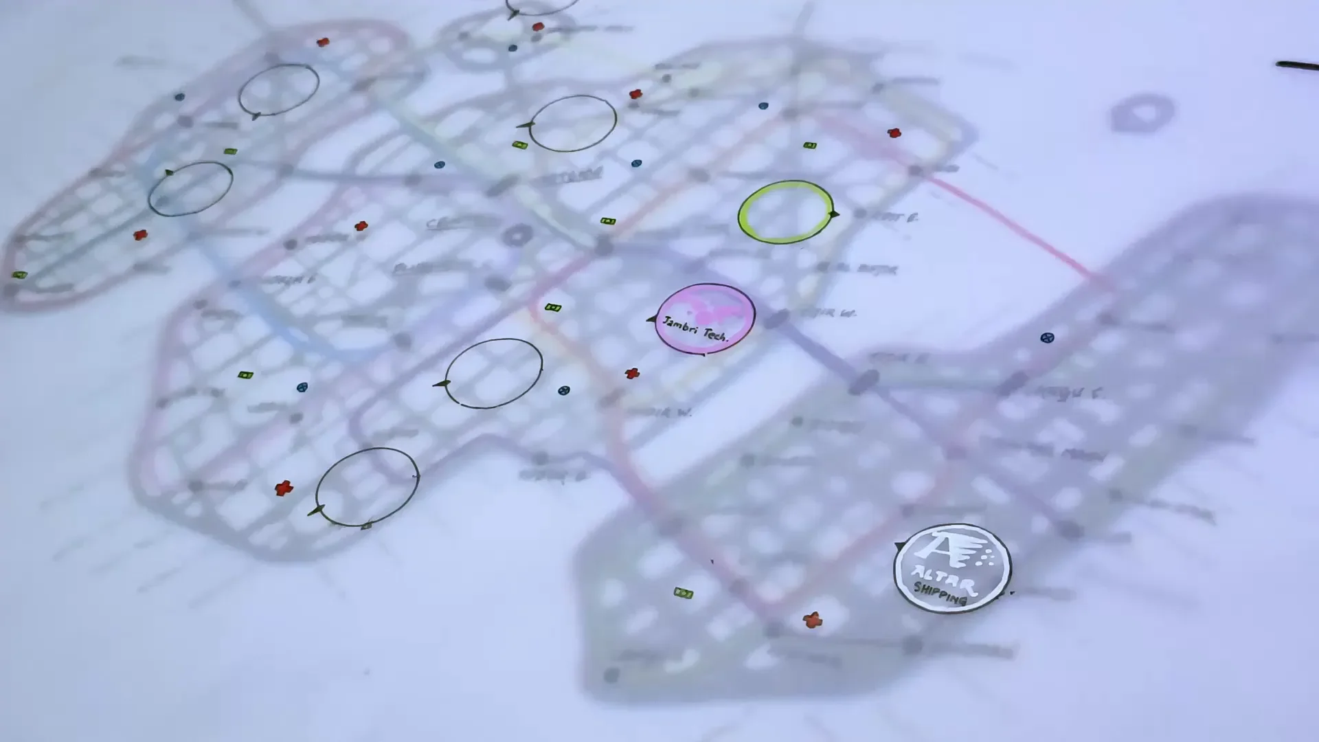
Step 1 — The base map: footprint, grid choice, and color palette
The base layer is the single most important piece. It must remain readable once the other sheets are placed on top, so I used a limited palette: black linework, white highlights, and a subtle color diffraction (magenta/cyan) around islands and water borders. The goal is to hint at neon without overpowering the other layers.
Two lessons came out of my first pass. Initially I traced individual buildings and then drew roads, and it looked busy and inconsistent. The better approach was to lay down a ruled grid first, then use that as the basis, adding slight imperfections with a black pen to bring life and grit.

Why the grid? For cyberpunk we want density. A rigid grid makes blocks tighter and roads narrower, which produces that claustrophobic feel of a packed metropolis — exactly what gives the city its personality. If you prefer a more chaotic, organically grown city, break the grid in places, but keep the visual density consistent.
Label streets around the outside edge rather than inside the map. I placed street names on the exterior because there’s more visual real estate and it keeps the interior clean. External labels read better through overlays and won’t jam up the street-level detail the players will need when the icon layer is on top.
The borders, registration crosses, and a small compass in the corner weren’t decorative choices; they are practical. Those marks are how you line up the different sheets so nothing drifts when you stack them. It’s the same trick printers use to calibrate ink.

Step 2 — The transit layer: subway, tram, and movement logic
In a dense cyberpunk city, public transit is a narrative engine. Not everyone has a hovercar; many characters rely on tram networks, taxis, and underground lines. My transit layer was inspired by the Tokyo subway map — a glorious spaghetti bowl of lines. That aesthetic works perfectly for cyberpunk because it visually communicates complexity and routes of influence.

A few concrete design decisions:
- Use bright, distinctive colors for each line so routes remain readable even through semi-opaque tracing paper.
- Make station nodes dark points, then label them with a condensed cyberpunk-style hand-lettering. For hand-drawn fonts, try tapering the stroke up at the end of each letter to get that graffiti-inspired look.
- Keep track of each transit line’s function — commuter line, freight loop, corporate express, gang-run shuttle — and use those in your scenes. The color of the line can hint at its purpose: corporate lines are glossy cyan; freight lines are industrial gray; gang shuttles are dirty magenta.
"This is what the subway looks like." — use that reveal as a gameplay moment. Hand this layer to players once they gain a contact, earn access, or hack a terminal.
Mechanically, the transit layer helps answer: where do players go? It feeds on-screen decisions during chases, smuggling runs, rescue ops, or long infiltration setups. When you hand this sheet to the players you can literally place stickers or pins to mark where their contacts are, where surveillance cameras are, or where a chase started.
Step 3 — The icon layer: vendors, medcaches, quest leads, and megacorps
With the base and transit done, the third layer is where the game happens. I designed a simple icon set — small, readable, and evocative — that functions like a video-game HUD mapped onto the city.
The core icons I used:
- Red cross — medical centers and clinics (yes, technically I violated the Geneva Convention by using the red cross, but it’s an instantly recognizable symbol; use your own alternative if you want to stay canonical).
- Blue circles — markets: where players buy, trade, and procure illicit goods.
- Green rectangles — job boards, bounty points, or cash-generating opportunities.

Above those small icons I added ten main dark icons: nine corporate hubs and one high-security final site. These are the macro-quest nodes — the places the campaign will orbit around. In the conceit I used, players obtain a data chip listing nine corporations and a blacked-out "final" location — which is the punctuating reveal later in the game.

This icon layer is the one you hand to players when they’ve earned it. It reads like an intel drop: minimal context, a few names, and coordinates. Now the party has to do the legwork — meet contacts, surveil, hack, bribe — to turn that list into actionable missions. Because the icons are separable you can update them physically as the campaign changes (stickers, pencil notes, or new tracing overlays).
Labeling strategy and visual clarity
Label dense cities externally, use a small fine-liner for street names, and reserve interior space for icons and transit nodes. This approach reduces clutter and keeps focus on gameplay elements.
If you use a grid, don’t number the streets mechanically. Names are friendlier for worldbuilding. The grid is a structural tool for you; the naming gives flavor. Place names come from transit focus: what line serves that block? What industry centers there? Those answers give you neighborhood names organically.
Practical tips & troubleshooting
Making a hand-layered cyberpunk map has technical quirks. Here are the main things I ran into and my solutions.
- Tracing paper absorbs differently: The tracing paper soaked up the acrylic pen differently than watercolor paper, which meant longer drying times and occasional bleeding. Work in stages. Let each sheet dry fully before stacking.
- Registration drift: Use the border crosses and a small compass point. Tack the layers lightly with blue tack and check registration before committing to labels.
- Font and lettering: For that punk cyber style, I tapered strokes upward at the end of lines when hand-lettering. If that feels too fiddly, use a simple condensed printed font if you’re working digitally or stencil transfer for a consistent look.
- Too much detail: Resist packing the base map with tiny building-level detail. The base must be readable; save details for layers. If you find you’ve over-drawn, simplify with a thin wash of black or white to normalize contrast.
- Color bleeding: When stacking bright lines (like neon transit) on top of colored bases, test on a scrap sheet to make sure the colors read through the tracing paper and don’t muddy into each other.
How to use the layered map at the table
This is where the system shines: the map is not a static prop but a tool for pacing and discovery. Here are several ways to use the map in your sessions.
Reveal progression
- Start with the base map as the city reference. Players have the layout, street names, and their approximate area of operations.
- When the party makes a connection, provide the transit layer and say, "You've got subway access now — this shows the lines with the stops you can use."
- Once they obtain an intel cache or a data chip, hand them the icon layer with marked targets.
Scenarios
- Heist mission: Use the transit layer to plan ingress and escape routes. You can add a temporary sticker showing a patrol schedule or blacked-out platform times.
- Rescue op: The icon layer marks medical caches and megacorp labs. Players may need to plan a route that avoids corporate express lines.
- Smuggling chain: Track cargo lines, warehouse nodes, and trade markets. The transit map shows chokepoints where authorities scan transit tokens.
- Gang turf war: Add a temporary overlay marking zones of influence and patrol corridors.
Dynamic updating
Use removable tapes, stickers, or erasable markers on a plastic overlay to mark dynamic elements like temporary roadblocks, current bounty targets, or active surveillance drones. This keeps your main sheets pristine and gives players a tactile sense of changing city dynamics.
Advanced layers and ideas to expand your map
If you want to take the concept further, consider additional distinct layers you can hand out as rewards, complications, or secrets:
- Under/Overcity vertical layers: Add separate sheets for elevated sprawl and undercity warrens. This emphasizes social verticality — elites on top, lowlifes below.
- Augmented Reality (AR) overlay: A translucent layer that shows advertisements, AR-only waypoints, and corporate-branded geo-fences visible only if players have the right implant or hacking tool.
- Security net: Mark camera nodes, scanner gates, patrol routes, and alert thresholds. Perfect for stealth runs and hacking minigames.
- Power and utilities: Show transformer nodes, black market power taps, and the backbone that keeps district lights on — and the one vulnerability that lets enemies plunge an area into darkness.
- Noise and reputation maps: Heatmaps for police attention or gang influence that change with player actions.
- Cargo/logistics chain: Route the supply lines for a corporate project: warehouses, shipping docks, consolidation hubs — ideal for prolonged campaigns about supply disruption.
Each new overlay should have a distinct purpose and be revealed with narrative justification. A data chip gives transit lines; a hacker friend provides the security net; a corporate whistleblower hands over an AR overlay. Keep the world-building diegetic — make the acquisition of each layer a story beat.
Digital hybrid workflow: when to go digital
If you want to mix handcraft and pixels, here’s a practical hybrid approach that preserves the handmade feel while gaining digital conveniences:
- Draw the base by hand and scan it at high resolution. Clean up linework in a raster editor.
- Create transit and icon layers in a vector program or layered raster file, so you can tweak colors and opacity easily without re-drawing.
- Keep registration crosses and export layers for printing on transparent film or tracing sheets.
- If you want to remain purely analog but need many copies, scan your original and print onto transparency sheets; place these over your original to test layering.
Going digital gives you better control over color blindness accessibility, consistent fonts, and quick updates. But hand-drawn sheets feel tactile and encourage players to interact physically with the map. Pick what sustains your table’s engagement.
Accessibility & color considerations
Neon palettes look great but can be problematic for color-blind players. A few tips to keep things readable for everyone:
- Use distinctive shapes in addition to color (different node shapes for clinics, markets, jobs).
- Add light/dark contrast — neon on dark backgrounds tends to read well for many vision types.
- When in doubt, label icons with a small letter or number keyed to a legend the players can reference.
Common mistakes and how to fix them
- Over-detailing the base: Remove extraneous lines, simplify building footprints, and use white highlights to reduce noise.
- Poor registration between layers: Add bigger registration marks and tack sheets down while working to prevent drift.
- Color muddying: Test color combinations on scrap tracing paper before committing. Use opaque white highlights to separate seams.
- Overloading players with info: Reveal layers incrementally. A data-dump map is less fun than a mystery map that rewards investigation.
Quick recipe — a one-page checklist to make your own
- Gather materials: A3 watercolor base, two A3 tracing sheets, acrylic pens, fine liner, ruler.
- Draw a ruled grid on the base to set block density. Add roads, islands, and a few imperfect building shapes.
- Keep palette tight: black, white, cyan/magenta for diffraction. Add registration crosses and a compass mark.
- Create the transit layer on tracing paper with bright distinct lines and station nodes.
- Create the icon layer with three small icons (meds, markets, jobs) and nine megacorp nodes + final black site.
- Test stacking, let inks dry, and tack layers together for play.
- Reveal layers in-game as narrative beats (contacts, data chips, access tokens).
Example narrative: the data-chip intel drop
Want a short example of how this map becomes a story device? Here’s the conceit I used:
Players corner a low-level smuggling operation and get access to a small encrypted data-chip. It contains a list of nine corporation names and one blacked-out site. You hand them the icon layer and say, “This is the list. You’ve got names and coordinates. Nothing else.” They can then use the transit layer to travel between nodes, surveil targets, and talk to contacts listed on the markets. As they cross each megacorp node, new intel can appear: a ledger, a security schedule, a black van route. The blacked-out site remains a mystery until they piece together who controls which line and why the final node is so heavily protected.
Troubleshooting real-world production issues
You will run into paint drying times and bleed issues. I found that tracing paper behaves differently, so I worked in stages: first the base, then the transit, then the icon layer — letting each dry overnight if necessary. Use low-tack adhesive (blue tack) to pin sheets during work, and always test the whole stack under the light you’ll game in so the colors read correctly under your session lighting.
Final thoughts
Mapping a cyberpunk city by hand forces you to make deliberate choices about what players see and when. The layered method gives you narrative control and tactile surprises: hand a layer to the players at the right story beat, and you create a physical sense of discovery. Keep the base clean, use transit as a movement skeleton, and let icons be the game’s heartbeat.
If you try this, I’d love to hear what layers you add and how players respond. I’m likely to revisit this — and eventually I’ll try Cyberpunk 2077 so I can better understand some of the modern biological and social mechanics that inspire these maps — but for now, this approach has given me a way to make a tactile, evocative, and mechanically useful city map that feels cyberpunk to the core.
Happy mapping, and may your neon lines always find their station.
Made with VideoToBlog using S11E6 How to Cyberpunk a Map.mp4